Brand Touchpoint Board — GPT Image 2 prompt template
Brand & Logos · Brand · Identity · Campaign
A campaign rollout board: the same visual idea shown across packaging, social, web and out-of-home panels, arranged as a single sheet.
Campaign boards across packaging, social, web, and display contexts. Use it to preview how one campaign idea survives contact with different formats, which is the question a single hero visual never answers.
When to use it
Use for multi-touchpoint campaign boards and brand rollout previews. It sits in the Brand & Logos group of the catalog, which covers logos, identity systems, brand touchpoints, and campaign visuals. If your brief is closer to one of the neighbouring genres, the related templates at the bottom of this page are the faster route — picking the right template matters more than perfecting the wrong one.
The template
Copy the block, replace everything inside brackets with your own specifics, and delete any line that does not apply to your brief. The template text is published in Chinese, as it appears in the upstream catalog; the structure is what carries the value, so translating the labels into your own language changes nothing about how it works.
为[品牌名]生成一张高端品牌触点系统视觉板,不是单张海报,而是一套完整品牌应用展示。

品牌定位:[行业/生活方式/产品品类]
核心气质:[关键词1]、[关键词2]、[关键词3]
主视觉场景:[核心产品/服务/体验],放在[材质表面/空间场景]中,使用[光线]和[镜头]呈现。

触点系统必须包含:
- 主产品 hero shot
- 包装盒 / 手提袋 / 杯子 / 标签 / 贴纸 / 封签等品牌物料
- 菜单卡 / 价目表 / 小型排版样张
- 生活方式场景或用户使用片段
- 配色、字体、图形语言在不同触点上的统一应用

设计语言:
[现代极简/日式留白/奢华编辑/科技品牌],主色[颜色],辅助色[颜色],大量留白,细腻材质,真实阴影,微小文字清晰可读。

构图要求:
像顶级设计机构提案页,所有触点整齐但不死板,主视觉最突出,辅助物料层级清楚,整体有品牌系统感和可落地感。

约束:
不要只生成一个 logo;不要把所有物料挤成杂乱拼贴;不要使用随机乱码文字;不要让包装、菜单、贴纸彼此风格割裂。
JSON version (agent-friendly)
Every Brand & Logos template shares one JSON block, which expresses the same kind of decisions as key–value fields rather than prose. Use it when a script, an agent or a form fills in the values, or when you want to change a single field between runs and see exactly what changed; swap the example values for your own.
{
  "type": "Brand Identity Design",
  "brand": {
    "name": "Nova Dynamics",
    "industry": "AI Technology",
    "keywords": ["Innovative", "Minimalist", "Trustworthy"]
  },
  "deliverables": [
    "Logo mark (geometric fusion of a neural network node and a star)",
    "Color palette (Electric Blue and Pure White)",
    "Business card mockup"
  ],
  "style": "Modern corporate, flat vector, high contrast",
  "constraints": "No gradients, scalable vector style, clean white background for logo"
}
How to fill it in
The block above asks you to make 12 explicit decisions before you send anything. That is the point of a template: the decisions you do not make are made for you, and in image generation the defaults are what produce work that looks generic.
Name the touchpoints explicitly and describe the arrangement of the panels, because the board's readability depends on the grid as much as on the artwork inside it.
State one palette and one typographic logic that applies to every panel. Shared rules are what turn a set of mockups into a system.
- Specify touchpoint list, shared visual rules, and mockup arrangement.
- Use one palette and one typography logic across all panels.
A working order for the whole thing: fill the structural slots first (subject, layout, format), then the visual ones (palette, light, material), then the text that has to appear verbatim, and only then the mood words. Run it once, change one field, run it again — a template you iterate one variable at a time tells you which variable did the work, which a rewritten prompt never does.
Common mistakes
Mixing several campaign styles onto one board produces a mood collage: each panel is fine on its own and none of them prove a rollout.
Overloading the panel count is the other error — past a handful, individual mockups become too small for their content to read, and the board stops being useful in a pitch.
- Avoid mixing many unrelated campaign styles.
- Limit touchpoints if readability drops.
Example results
These are the public posts this template was distilled from: the creator shared the image and the prompt behind it, and the recurring structure across cases like these became the block above. Each card links back to its source, and a public post is not a licence to reuse the image.
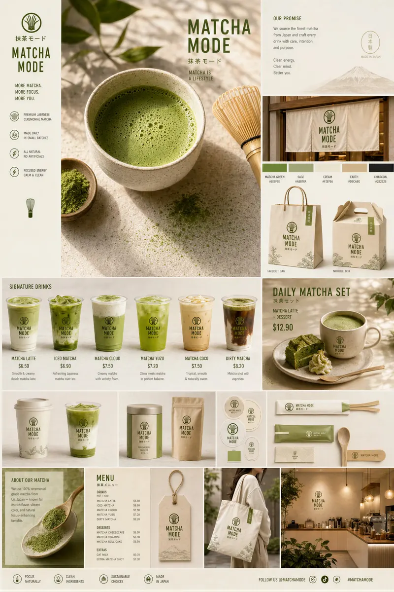
抹茶品牌触点系统视觉板
Create a premium “Matcha Brand Touchpoint System” visual board for a modern lifestyle brand called: “MATCHA MODE” Build a full brand identity system, not a sing

More templates in this category
The catalog keys its blocks by category, so every Brand & Logos template ships with the same set of 6. The one above is the block that matches this template; these 4 are its neighbours, kept here in case one of them is closer to your brief.
Standard template
为[品牌名]设计品牌视觉方案。
品牌关键词:[关键词1]、[关键词2]、[关键词3]。
包含:Logo方向[几何/字标/图形]、辅助图形、主辅色、应用示意。
风格:[现代/高级/亲和],行业:[行业],受众:[受众]。
输出:统一风格的品牌识别视觉图。
Full brand identity package template
你是顶级品牌代理创意总监,目标是为[业务/产品]交付一套覆盖 Logo、配色、字体、语调和应用触点的完整品牌身份系统。

输入信息:
业务名称:[业务名]
业务描述:[一句话说明]
行业:[行业]
目标受众:[详细描述]
竞争对手:[3-5个]
品牌个性:[5个关键词]
希望触发的感受:[信任 / 兴奋 / 奢华 / 亲近 / 力量 / 其他]
喜欢的视觉身份:[3个参考]
讨厌的视觉身份:[3个反例]
设计预算:[免费 / 付费]

请输出:
1. 品牌战略基础:品牌原型、核心承诺、定位、差异化和唯一关键词。
2. Logo 概念:生成 3-5 个完全不同的 Logo 方向,每个方向说明核心视觉理念、形状语言、象征意义、字体方向、第一眼情绪和适用触点。
3. 配色系统:主色、辅助色、强调色、中性色、HEX 代码、心理学解释、使用规则和禁用搭配。
4. 字体系统:标题字体、正文字体、强调字体、字号层级、字距、行高和免费替代方案。
5. 应用触点:名片、App 图标、网站首页、社媒模板、广告牌或包装上的应用效果。
6. 品牌规则:3 条永远不要打破的核心品牌规则。

输出形式:
结构化品牌手册,任何设计师、开发者或 AI 工具都能在 10 分钟内理解并复用。
Brand-wrapped product ad template
输入:[产品图]、[品牌身份]、[输出格式]

PHASE 1 / ANCHOR:用 2 行描述[品牌身份],包括调色板、材质、光影和情绪。
PHASE 2 / INJECT:把[产品]放入这个品牌世界中,产品要服从品牌气质和环境语言。
PHASE 3 / FORMAT:指定[输出格式],例如 hero 图、方形广告、竖版 story 或电商头图。
PHASE 4 / SIGNATURE:加入[品牌元素],例如颗粒、阴影、叠加纹理、包装符号或图形边框。

变量:
[品牌身份] / [产品] / [输出格式] / [品牌元素]

目标:同一品牌下替换不同产品时,视觉世界保持一致,广告图仍然有明确主角和商业质感。
Brand persona comic infographic template
基于上传的[Logo/品牌视觉],生成一张 4:5 竖版漫画信息图:“What This Brand Feels Like”。
目标:把品牌变成一个可感知的人格角色,并解释它如何说话、行动、销售、回应竞争和处理批评。
核心规则:所有颜色、服装、姿态、语气和图形元素都来自 Logo 与品牌关键词。
主视觉:一个品牌人格化角色,服装、表情和姿态体现[品牌气质]。
周围结构:6-8 个漫画小分镜,每格包含短标题、动作、气泡或内心独白。
辅助模块:Voice tone、Energy level、Social behavior、Communication style、DO / DON'T。
风格:漫画 + 编辑信息图,表达强但保持高级,文字短而有力,画面层级丰富。
约束:不要通用营销词,不要空白区域,不要把品牌人格画成随机角色。
Related templates
- Brand Identity Package — Logo, palette, typography, applications, and brand touchpoints.
- Architecture & Space — Interior, exterior, city, map, and spatial concept visuals.
- Realistic Photography — Lens, lighting, film texture, and documentary-style photo prompts.
- Street Accident Moment — Realistic phone-photo scenes with negative constraints.
- Illustration & Art Style — Anime, watercolor, ink, material experiments, and art direction.
Frequently asked questions
- How is this different from the brand identity package?
- The identity package defines the system — mark, palette, type, rules. This board applies one campaign idea across contexts. Identity first, rollout second, and the two boards answer different questions in a pitch.
- Which touchpoints are worth including?
- The ones your audience actually meets: primary packaging, the social format you post most, one web surface and one physical placement. A touchpoint nobody sees adds a panel and proves nothing.
- Is the Brand Touchpoint Board template free to use?
- Yes. The template text comes from the open-source awesome-gpt-image-2 catalog by freestylefly, published under the MIT licence, and PicGens reproduces it with credit. Copy it, fill in the brackets and paste it into whichever tool you run GPT Image 2 in.
- What is the JSON version of the template for?
- It carries the same decisions as key–value fields instead of prose, which is easier for an agent or a script to assemble programmatically and easier to diff when you iterate. Use the plain-text block when you are writing by hand and the JSON block when something else is filling in the values.
- Why does this page show other Brand & Logos templates?
- The upstream catalog groups its blocks by category, so every Brand & Logos template ships with the same set of 6 blocks. The one at the top of this page is the block that matches this template; the remaining 4 are kept collapsed in case a neighbouring variant fits your brief better.
- Where do the example results come from?
- They are public posts by creators who shared both the image and the prompt behind it, collected in the same open catalog. Each one links back to its source, and a public post is not itself a licence to reuse the image.
中文说明
品牌触点视觉板 — 生成包装、社媒、网页和展示场景里的品牌触点板。
用于多触点 Campaign 展示和品牌落地预览。
- 指定触点清单、统一视觉规则和样机排列。
- 让所有面板共享配色和字体逻辑。
- 避免混入多个无关 Campaign 风格。
- 可读性下降时减少触点数量。
Keep exploring
Template text and case metadata from awesome-gpt-image-2 by freestylefly, used under the MIT licence. English commentary by PicGens. Results vary by model version, reference image and settings.