Monocolor Editorial Print
One- and two-ink editorial prints — halftone, riso, cyanotype or photocopy — for posters, zines and covers.

Designers / Zine makers / Event organisers
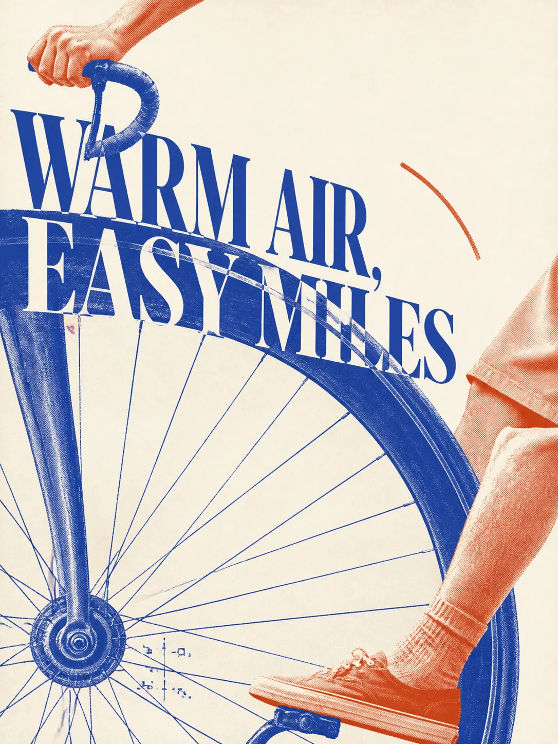
Preview: example output from yanliudesign/mono-color-skill by yanliudesign, reproduced under the MIT licence.
Suggested prompts
Written by PicGens as starting points. Click one to copy it, then paste it to your agent once the skill is installed.
About this skill
Monocolor Editorial Print constrains every image to the economics of real printing: one ink, or two carefully assigned plates, on a white, cool grey or pale beige stock. By default a dominant plate covers most of the image and an accent plate the rest, rendered through halftone, risograph, cyanotype or photocopy treatments, with a generous share of bare paper on an asymmetric grid.
The skill follows five steps — read the input, choose a layout, assign plates, compose, then generate and inspect — and each step guards something specific: the ink count, the identity of a supplied subject, the typographic hierarchy and the originality of the result. It works from a theme, a phrase, an object or a photograph, and suits posters, zines, portraits, packaging and social covers. You get the image, the exact production prompt and a short recipe for repeating it.
What it makes
A one- or two-ink editorial image, the production prompt and a reusable recipe.
Before you install: An agent with image generation.
From the project README
Reproduced from yanliudesign/mono-color-skill by yanliudesign under the MIT licence; shortened here — read the rest on GitHub.
中文 · English
Monocolor Editorial Print
A one-ink and controlled two-ink editorial image skill for posters, zines, portraits, packaging, and visual field notes.
Turn a theme, sentence, object, or supplied photograph into an original editorial image. The skill defaults to controlled two-ink with one dominant plate and one narrowly assigned accent plate. Explicit one-ink or monochrome requests remain pure one-ink. White, cool gray, or pale-beige substrates are selected from the image and palette; contemporary editorial is the default, while vintage treatment appears only when requested.
It preserves a visual system rather than copying a reference. Every composition is rebuilt around the subject, intent, words, and image role.
Selected examples
| Summer cycling | Field study | Ordinary spaces |
|---|---|---|
 |
 |
 |
| Sardine packaging | Headphone packaging | Sunscreen packaging |
|---|---|---|
 |
 |
 |
| A little warmth | Brand merchandise | Slow leaf |
|---|---|---|
 |
 |
 |
| Night photography | Sunday radio | Night market |
|---|---|---|
 |
 |
 |
These original generated examples demonstrate the skill's range; they are outputs, not templates to reproduce.
Visual references
The visual system was informed by a twelve-image research set. See Visual References and Attribution for the complete image index, research notes, attribution status, and correction link. Third-party references remain the property of their respective creators and rights holders.
| 01 | 02 | 03 |
|---|---|---|
 |
 |
 |
| 04 | 05 | 06 |
 |
 |
 |
| 07 | 08 | 09 |
 |
 |
 |
| 10 | 11 | 12 |
 |
 |
 |
What it does
| System | Direction |
|---|---|
| Input | A theme, phrase, object, article idea, or supplied photograph |
| Palette | Adaptive neutral white, cool gray, or pale beige + controlled two-ink by default; explicit one-ink requests stay one-ink |
| Modes | Pure one-ink, chromatic + black, complementary duotone, or overprint duotone |
| Image | Halftone, risograph grain, cyanotype exposure, or photocopy breakup |
| Space | 25%–55% visible empty paper on an asymmetric editorial grid |
| Type | Content-responsive literary serif, cultural grotesk, condensed civic, programmatic, rotated, handwritten, or word-as-object roles |
| Output | Generated raster image, exact production prompt, and a short recipe |
Use cases
- Posters: events, parties, art exhibitions, city walks, and conceptual posters
- Social media: Xiaohongshu covers, WeChat article headers, podcast covers, and cultural commentary illustrations
- Brand materials: postcards, invitations, tickets, programs, menus, and packaging stickers
- Keepsakes: travel journals, photo album covers, and anniversary cards
- Books and publications: covers, title pages, chapter openers, and zine interiors
- Words: literary excerpts, poetry, and personal declarations
All of these formats can use a single ink to reduce production costs while retaining a distinctive visual identity.
How it works
1  Read the input       →  identify subject, intent, words, and image role
2  Choose the layout    →  image, specimen, declaration, object field, overprint, journal, or cover
3  Assign the plates    →  default to two assigned roles; switch to one plate when explicitly requested
4  Compose the page     →  preserve 25%–55% silence and add one deliberate disruption
5  Generate and inspect →  check ink count, identity, hierarchy, texture, and originality
Ink system
One-ink palette: Cobalt, Royal Blue, Botanical Green, Mint Green, Terracotta Orange, Signal Red, Aubergine, and Charcoal.
| Swatch | Ink | Hex |
|---|---|---|
 |
Cobalt / Ultramarine | #2148B8 |
 |
Royal Blue | #2058D4 |
 |
Botanical Green | #008A4B |
 |
Mint Green | #5EB783 |
 |
Terracotta Orange | #C65F38 |
 |
Signal Red | #C83232 |
 |
Aubergine | #63365F |
 |
Charcoal | #30343A |
Two-ink recipes: Powder Blue + Signal Red, Cobalt + Terracotta, Botanical Green + Oxblood, Charcoal + Signal Red, Electric Blue + Carbon, Mint Green + Charcoal, Ultramarine + Safety Orange, Cyan + Brick Red, and Tangerine + Slate Blue.
| Swatches | Two-ink recipe | Hex |
|---|---|---|
 |
Powder Blue + Signal Red | #9EB8D3 + #C83232 |
 |
Cobalt + Terracotta | #2148B8 + #C65F38 |
 |
Botanical Green + Oxblood | #008A4B + #8F3434 |
 |
Charcoal + Signal Red | #30343A + #C83232 |
 |
Electric Blue + Carbon | #173AE3 + #242321 |
 |
Mint Green + Charcoal | #5EB783 + #302D2E |
 |
Ultramarine + Safety Orange | #263E99 + #E55D2B |
 |
Cyan + Brick Red | #159DDA + #B64032 |
 |
Tangerine + Slate Blue | #E46C2D + #4773A5 |
In two-ink work, the dominant plate normally carries 70%–85% of the printed area. The accent plate carries 15%–30% and must have a specific job such as dates, annotations, selected objects, or overprint intersections. The substrate is not a third color, and the darker color created where two plates overlap is not a third ink.
Substrate is adaptive, not nostalgic by default: Neutral White #FAFAF7 supports crisp cultural, social, event, and image-led work; Cool Gray #E9E9E5 supports architecture, technology, charcoal-led systems, and restrained branding; Pale Beige #F5F1E8 supports tactile, travel, food, intimate, archival, or explicitly nostalgic subjects. Limited inks and halftone do not automatically imply vintage styling.
Visual rules
How to install Monocolor Editorial Print
1.Clone into Claude Code skills
git clone https://github.com/yanliudesign/mono-color-skill.git ~/.claude/skills/mono-color
Licence and attribution
Monocolor Editorial Print is created and maintained by yanliudesign and published at github.com/yanliudesign/mono-color-skill under the MIT licence. The summary, suggested prompts and “About this skill” text are written by PicGens; the README section is reproduced under the project’s licence. The preview is an example image from the repository, reproduced under its licence. PicGens is not affiliated with the author.
Related skills
All skills →Canvas Design
Get an original poster or art print drawn in code, plus the design philosophy behind it.
 anthropicsGitHub stars: 179k
GC Minimal Zine Poster
Get a quiet 3:5 zine poster plus the exact prompt and recipe to make more like it.
 LiamGvchiGitHub stars: 7.2k
Yingzao
Get an art-directed editorial poster from your photo of a Chinese building, street, craft or dish.
 op7418GitHub stars: 462
HEYTEA-Style Doodle Poster
Get two playful doodle posters from one product photo — with a hand-lettered title and without.
 Hchen1218GitHub stars: 313
Looking for prompts instead of a skill?
Browse real poster & visual prompts with the images they made, or give your agent the free PicGens template skill.