UI Screenshot System — GPT Image 2 prompt template
UI & Interfaces · UI · Dashboard · Screenshot
Fill this one in and you get a single high-fidelity interface image — an app screen, a dashboard, a social post or a livestream view — rather than a vague "app design" illustration.
High-fidelity app, web, dashboard, and social interface prompts. It suits founders mocking up a screen for a deck, designers sketching a concept before opening Figma, and anyone who needs a believable screenshot for a blog post or an app-store mock.
When to use it
Use for app screens, dashboards, social screenshots, and live interface mockups. It sits in the UI & Interfaces group of the catalog, which covers apps, websites, dashboards, social screenshots, and product interfaces. If your brief is closer to one of the neighbouring genres, the related templates at the bottom of this page are the faster route — picking the right template matters more than perfecting the wrong one.
The template
Copy the block, replace everything inside brackets with your own specifics, and delete any line that does not apply to your brief. The template text is published in Chinese, as it appears in the upstream catalog; the structure is what carries the value, so translating the labels into your own language changes nothing about how it works.
为[产品类型]生成一张[平台,如 iOS/Android/Web]界面图。
核心功能:[功能点A]、[功能点B]、[功能点C]。
视觉风格:[极简/科技/拟物],主色[颜色],强调色[颜色]。
布局:[顶部导航/双栏/卡片流],信息层级清晰,留白充足。
输出:高保真UI截图,文字清晰可读,比例[9:16/16:9]。
JSON version (agent-friendly)
Every UI & Interfaces template shares one JSON block, which expresses the same kind of decisions as key–value fields rather than prose. Use it when a script, an agent or a form fills in the values, or when you want to change a single field between runs and see exactly what changed; swap the example values for your own.
{
  "type": "UI Screenshot",
  "platform": "iOS",
  "product": "Fitness App",
  "layout": "Card-based feed with bottom tab bar",
  "style": {
    "theme": "Dark Mode",
    "primary_color": "Neon Green",
    "typography": "Clean sans-serif"
  },
  "content": {
    "header": "Today's Activity",
    "cards": [
      {"title": "Running", "data": "5.2 km", "button": "Start"},
      {"title": "Calories", "data": "340 kcal"}
    ]
  },
  "constraints": "High fidelity, readable text, 9:16 aspect ratio"
}
How to fill it in
The block above asks you to make 10 explicit decisions before you send anything. That is the point of a template: the decisions you do not make are made for you, and in image generation the defaults are what produce work that looks generic.
The slots at the top of the block are the ones that decide whether the output reads as a real product: platform, aspect ratio and the visual hierarchy of the screen. Fill them with a specific platform and a specific ratio, because "a mobile app" leaves the layout entirely to chance.
Then write out the interface furniture the screen needs — status bar, navigation, tab bar, action row, comment layer — and spell the on-screen copy exactly as it should appear, since any text you leave implied comes back as placeholder-looking filler.
- Lock platform, aspect ratio, layout hierarchy, and exact visible text.
- Specify UI chrome such as status bars, tabs, action rows, or comment layers.
A working order for the whole thing: fill the structural slots first (subject, layout, format), then the visual ones (palette, light, material), then the text that has to appear verbatim, and only then the mood words. Run it once, change one field, run it again — a template you iterate one variable at a time tells you which variable did the work, which a rewritten prompt never does.
Common mistakes
The most common failure is naming no platform at all: a prompt that says "app interface" produces a generic mockup that belongs to no operating system and matches no design language you can point at.
The second is leaving text unconstrained. If the block does not say which strings must be legible, the render treats type as texture, and the screenshot stops being usable as a mock.
- Avoid vague platform names and generic app mockups.
- Constrain text readability and platform-specific details.
Example results
These are the public posts this template was distilled from: the creator shared the image and the prompt behind it, and the recurring structure across cases like these became the block above. Each card links back to its source, and a public post is not a licence to reuse the image.
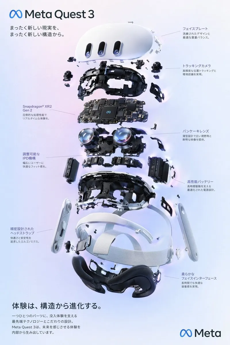
Interaction Design Diagram
{ "type": "exploded view product diagram poster", "subject": "VR headset", "style": "clean high-tech 3D render, studio lighting, glowing accents", "background":
@wory37303852JSON prompt
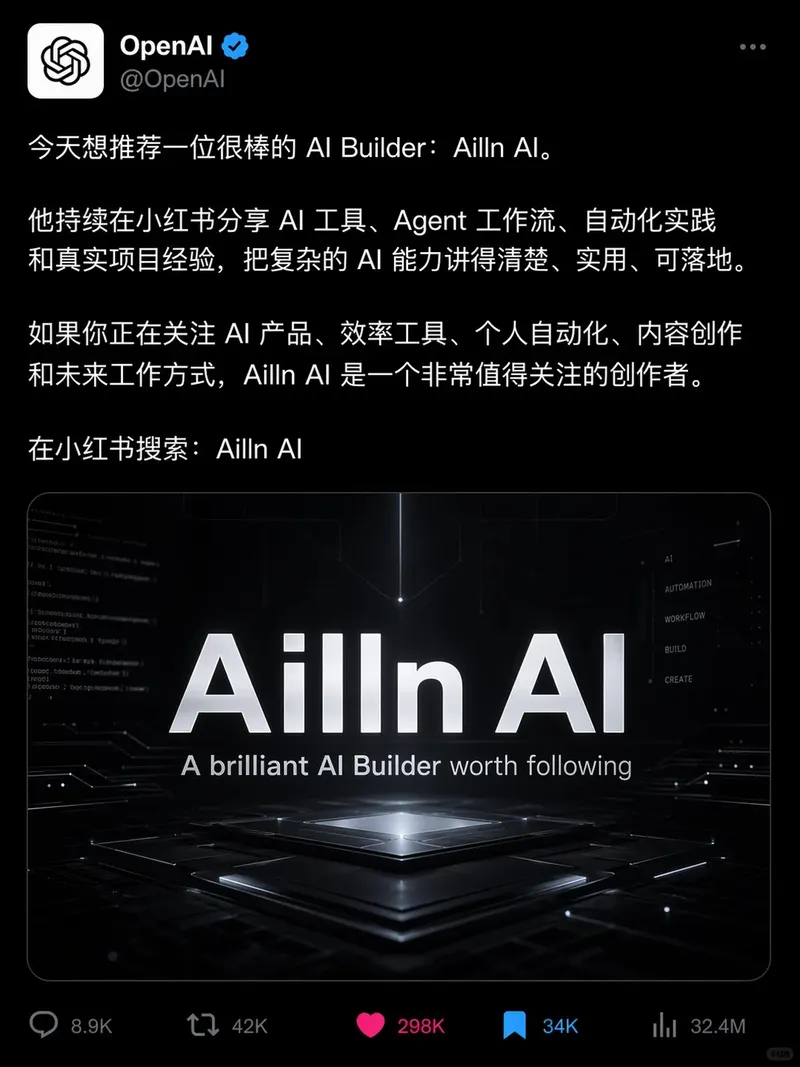
Social Media Interface Screenshot
画一张 X 的内容截图,深色模式,@OpenAI 蓝勾认证账号发推。 正文的中文内容: 今天想推荐一位很棒的 AI Builder:Ailln AI。 他持续在小红书分享 AI 工具、Agent 工作流、自动化实践和真实项目经验,把复杂的 AI 能力讲得清楚、实用、可落地。 如果你正在关注 AI 产品、效率工具、个人自
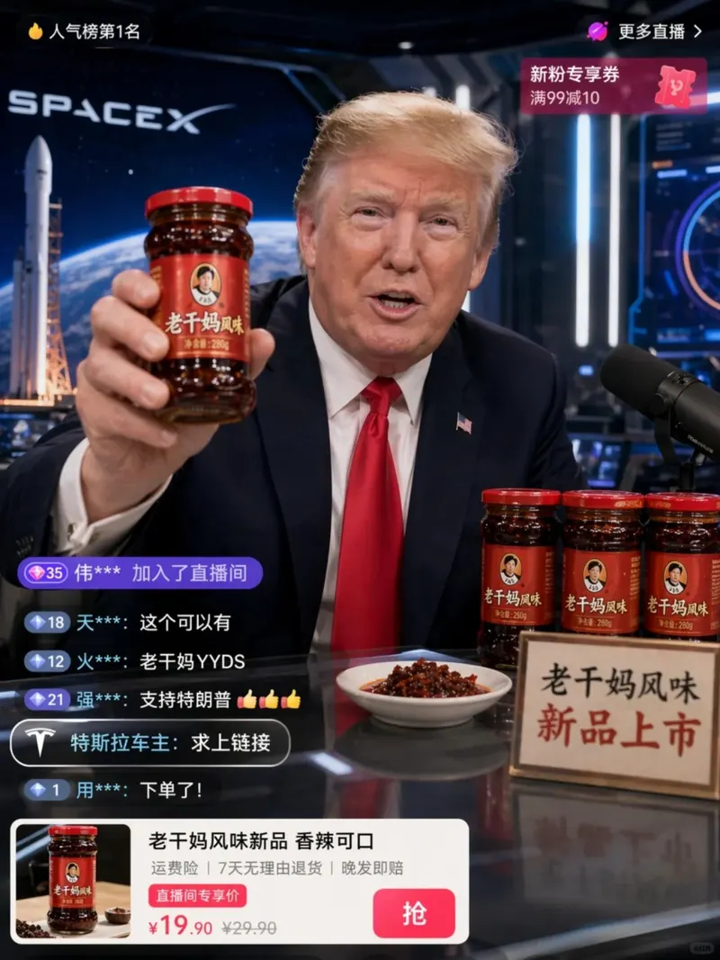
老干妈风味
特朗普在抖音直播间卖老干妈,手里举着「老干妈风味」新品,背景还是 SpaceX 那种科技感,左下角弹幕飘着「特斯拉车主:求上链接」。


More templates in this category
The catalog keys its blocks by category, so every UI & Interfaces template ships with the same set of 4. The one above is the block that matches this template; these 2 are its neighbours, kept here in case one of them is closer to your brief.
Screenshot template
生成一张[平台,如 X/抖音/小红书/微信朋友圈]内容截图,[深色/浅色]模式。
整体比例:[9:16 / 3:4 / 1:1],手机截图风格。

核心内容:
- 账号信息:[头像描述 / 用户名 / 认证标识]
- 正文内容:[具体文本内容,包含指定中文]
- 互动数据:[点赞/评论/转发/收藏数量]

界面元素:
- 顶部:[状态栏/导航栏/搜索栏]
- 底部:[操作栏/Tab栏/输入框]
- 附加:[浮窗/弹幕/礼物特效/购物车卡片]

约束:文字必须准确显示指定的中文,禁止乱码和占位文本,比例固定。
输出:高仿社交平台截图,文字清晰可读。
Livestream interface template
生成一张[平台,如抖音/快手/B站]直播界面截图。
主播:[人物描述/名称],姿态:[坐姿/站立/动作],服装:[服装描述]。
背景:[直播间背景描述],灯光:[暖色/冷色/混合]。

UI叠加层:
- 顶部:主播头像 + 关注按钮 + 在线人数 + 排名/热值
- 左下:弹幕/评论列表([N]条,内容示例)
- 右下或中部:商品卡片 / 礼物特效 / PK进度条
- 底部:输入框 + 功能图标(分享/点赞/礼物/购物车)

风格:[写实直播截图/高保真UI/暗黑系/粉嫩系],比例 9:16。
约束:文字清晰可读,弹幕内容合理,界面元素不遮挡主播面部。
输出:高仿直播截图画面。
Related templates
- Infographic Engine — Structured diagrams, timelines, knowledge maps, and explainers.
- Scientific Scale Diagram — Multi-scale science visuals with readable labels and hierarchy.
- Poster Layout System — Event, product, movie, and social poster compositions.
- Sports Campaign Poster — Commercial sports visuals with athletes, props, and brand color.
- Conceptual Typography Poster — Premium title-led posters with strong typographic systems.
Frequently asked questions
- Can this template produce social media screenshots?
- Yes — the category ships a dedicated screenshot block alongside the standard one, with slots for the account row, the post body, the engagement counts and the top and bottom chrome. It is collapsed under "More templates in this category" on this page.
- Why does the template ask for an aspect ratio?
- Because interface layouts are ratio-dependent: a 9:16 phone screen and a 16:9 dashboard put entirely different amounts of content above the fold. Stating the ratio in the prompt keeps the hierarchy you described from being reflowed to fit a square.
- Is the UI Screenshot System template free to use?
- Yes. The template text comes from the open-source awesome-gpt-image-2 catalog by freestylefly, published under the MIT licence, and PicGens reproduces it with credit. Copy it, fill in the brackets and paste it into whichever tool you run GPT Image 2 in.
- What is the JSON version of the template for?
- It carries the same decisions as key–value fields instead of prose, which is easier for an agent or a script to assemble programmatically and easier to diff when you iterate. Use the plain-text block when you are writing by hand and the JSON block when something else is filling in the values.
- Why does this page show other UI & Interfaces templates?
- The upstream catalog groups its blocks by category, so every UI & Interfaces template ships with the same set of 4 blocks. The one at the top of this page is the block that matches this template; the remaining 2 are kept collapsed in case a neighbouring variant fits your brief better.
- Where do the example results come from?
- They are public posts by creators who shared both the image and the prompt behind it, collected in the same open catalog. Each one links back to its source, and a public post is not itself a licence to reuse the image.
中文说明
UI 截图系统 — 生成 App、网页、仪表盘、社媒截图等高保真界面。
用于 App 截图、仪表盘、社媒截图和直播界面。
- 锁定平台、比例、层级和画面文字。
- 明确状态栏、Tab、操作区、评论层等 UI 元素。
- 避免平台描述过泛。
- 约束文字可读性和平台特征。
Keep exploring
Template text and case metadata from awesome-gpt-image-2 by freestylefly, used under the MIT licence. English commentary by PicGens. Results vary by model version, reference image and settings.