Infographic Engine — GPT Image 2 prompt template
Charts & Infographics · Infographic · Chart · Education
This template turns an explanation into a structured graphic — three to five labelled modules, an explicit flow between them, and short labels instead of paragraphs.
Structured diagrams, timelines, knowledge maps, and explainers. Reach for it when you are explaining a process, a timeline or a concept map and a free-form prompt keeps returning decorative art with unreadable text where the information should be.
When to use it
Use for explainer graphics, technical diagrams, timelines, and knowledge cards. It sits in the Charts & Infographics group of the catalog, which covers infographics, knowledge maps, technical explainers, and structured diagrams. If your brief is closer to one of the neighbouring genres, the related templates at the bottom of this page are the faster route — picking the right template matters more than perfecting the wrong one.
The template
Copy the block, replace everything inside brackets with your own specifics, and delete any line that does not apply to your brief. The template text is published in Chinese, as it appears in the upstream catalog; the structure is what carries the value, so translating the labels into your own language changes nothing about how it works.
生成[主题:明确、具体,避免宽泛。例如:“老年人日常健康管理指南”而非“健康”]信息图,目标读者为[人群:细化人群特征,如年龄段、职业、兴趣等]。
结构:标题区 + [3-5]个模块(每模块含图标、短标题、1-2句说明,模块间逻辑:可用箭头、颜色区分或连接线提示信息流或关系等适当的方式)。
图表类型:[流程图/对比图/关系图/时间线]。
风格:[专业报告/科普插画/儿童教育等],主色[颜色],背景[浅色/深色]。
输出:信息层级清晰、可读性高的中文信息图。
JSON version (agent-friendly)
Every Charts & Infographics template shares one JSON block, which expresses the same kind of decisions as key–value fields rather than prose. Use it when a script, an agent or a form fills in the values, or when you want to change a single field between runs and see exactly what changed; swap the example values for your own.
{
  "type": "Infographic",
  "topic": "Urban Metabolism",
  "audience": "General Public",
  "structure": {
    "title_area": "城市生命系统图谱",
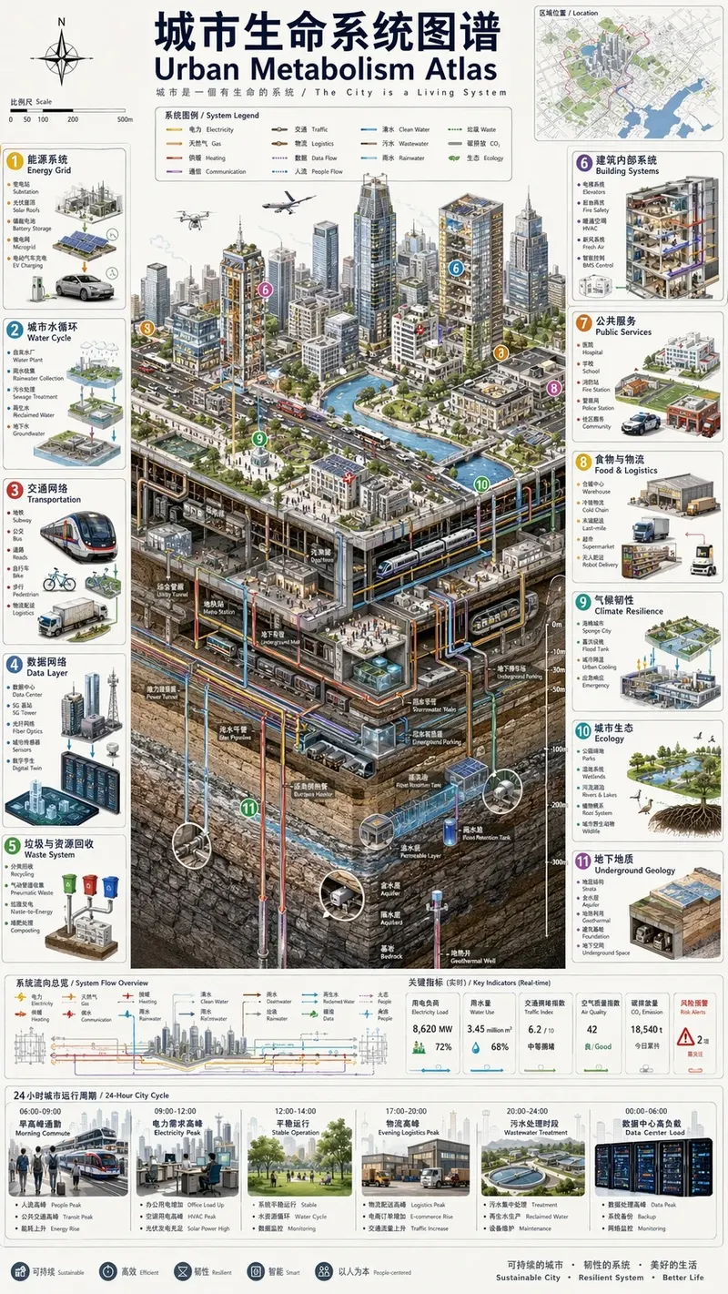
    "layout": "Isometric cutaway, 12 numbered panels",
    "modules": [
      {"title": "能源", "icon": "lightning", "text": "Power flows"},
      {"title": "水循环", "icon": "water_drop", "text": "Water flows"}
    ]
  },
  "style": {
    "aesthetic": "Scientific atlas",
    "colors": "Low saturation, color-coded flows",
    "background": "Light paper texture"
  },
  "constraints": "No cyberpunk, no gibberish text, strict structural layout"
}
How to fill it in
The block above asks you to make 7 explicit decisions before you send anything. That is the point of a template: the decisions you do not make are made for you, and in image generation the defaults are what produce work that looks generic.
Decide the module count before you write anything else. Three to five is the working range the template is built around, and each module needs a label short enough to survive being rendered as type inside an image.
State the direction of the flow explicitly — left to right, clockwise, top-down — and name the devices that carry it: arrows, colour groups, icons, spacing. An infographic without a stated reading order is just a collage of boxes.
- Define 3-5 modules, information flow, visual hierarchy, and short labels.
- Use color groups, arrows, icons, and clean spacing to reduce clutter.
A working order for the whole thing: fill the structural slots first (subject, layout, format), then the visual ones (palette, light, material), then the text that has to appear verbatim, and only then the mood words. Run it once, change one field, run it again — a template you iterate one variable at a time tells you which variable did the work, which a rewritten prompt never does.
Common mistakes
Pasting a paragraph into a module label is the fastest way to ruin the output; long text inside an image degrades into noise, so compress each label to a few words and keep the explanation in the caption outside the image.
Adding modules is also more damaging than adding detail. Once the count climbs past five, spacing collapses and the visual hierarchy the template asks for disappears.
- Avoid long paragraphs inside the image.
- Limit module count before adding visual detail.
Example results
These are the public posts this template was distilled from: the creator shared the image and the prompt behind it, and the recurring structure across cases like these became the block above. Each card links back to its source, and a public post is not a licence to reuse the image.
RAG Technical Explainer
帮我生成一张 RAG 技术的详细讲解图
Infographic Visualization
Vertical 9:16 isometric cutaway infographic "城市生命系统图谱 / Urban Metabolism Atlas". Smart city from sky to bedrock: skyscrapers, streets, subway, utility tunnels,
科普百科图
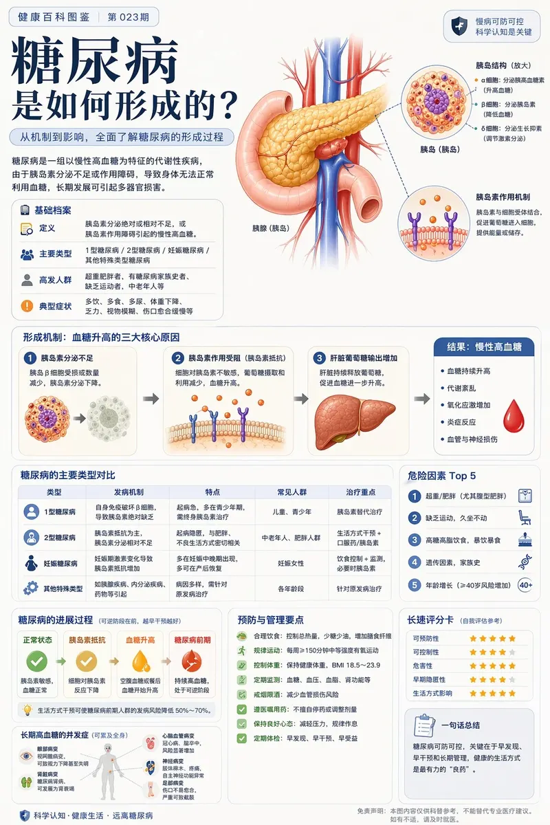
根据【主题】生成一张高质量竖版「科普百科图」。 这张图不是普通海报,也不是单纯插画,而是一张兼具图鉴感、百科感、信息结构感和收藏感的模块化科普信息图。整体风格参考高级博物图鉴、现代百科书页、生活方式知识卡,以及社交媒体上更容易传播的信息图风格。 让画面包含: 一个清晰好看的主题主视觉 若干局部特征放大细节 多个圆角模块


More templates in this category
The catalog keys its blocks by category, so every Charts & Infographics template ships with the same set of 3. The one above is the block that matches this template; these 1 are its neighbours, kept here in case one of them is closer to your brief.
Scale-comparison science infographic template
为[主题]生成一张科学尺度缩放信息图。
结构:6-8 个圆形或六边形框,按从微观到宏观的尺度递进排列。
每个框包含:尺度名称、3-5 个词的洞察、测量单位或放大倍率,以及该尺度下的高细节 3D 渲染。
用细线连接各尺度,避免重复层级。标题使用“[主题]:AT EVERY SCALE”或“ZOOM: THE WORLD OF [主题]”。
风格:科学编辑信息图、精准微距光、清晰层级、文字短而可读。
约束:不要通用放大镜图标,不要把所有尺度画成同一大小,不要塞长段正文。
Related templates
- Scientific Scale Diagram — Multi-scale science visuals with readable labels and hierarchy.
- Poster Layout System — Event, product, movie, and social poster compositions.
- Sports Campaign Poster — Commercial sports visuals with athletes, props, and brand color.
- Conceptual Typography Poster — Premium title-led posters with strong typographic systems.
- Ink Double Exposure Poster — Chinese ink, portrait, and layered atmosphere composition.
Frequently asked questions
- How many modules should an infographic prompt ask for?
- The template is written around three to five. Fewer than three rarely justifies an infographic layout; more than five crowds the canvas and pushes labels below a readable size.
- Can I use this for a timeline?
- Yes. A timeline is the flow slot set to a single axis: name the axis direction, give each stop a short label, and keep the module count inside the same three-to-five range per screen.
- Is the Infographic Engine template free to use?
- Yes. The template text comes from the open-source awesome-gpt-image-2 catalog by freestylefly, published under the MIT licence, and PicGens reproduces it with credit. Copy it, fill in the brackets and paste it into whichever tool you run GPT Image 2 in.
- What is the JSON version of the template for?
- It carries the same decisions as key–value fields instead of prose, which is easier for an agent or a script to assemble programmatically and easier to diff when you iterate. Use the plain-text block when you are writing by hand and the JSON block when something else is filling in the values.
- Why does this page show other Charts & Infographics templates?
- The upstream catalog groups its blocks by category, so every Charts & Infographics template ships with the same set of 3 blocks. The one at the top of this page is the block that matches this template; the remaining 1 are kept collapsed in case a neighbouring variant fits your brief better.
- Where do the example results come from?
- They are public posts by creators who shared both the image and the prompt behind it, collected in the same open catalog. Each one links back to its source, and a public post is not itself a licence to reuse the image.
中文说明
信息图引擎 — 生成结构化图解、时间线、知识图谱和技术解释图。
用于解释图、技术图解、时间线和知识卡片。
- 定义 3-5 个模块、信息流、层级和短标签。
- 用色块、箭头、图标和留白控制复杂度。
- 避免把长段正文塞进画面。
- 先限制模块数量,再补视觉细节。
Keep exploring
Template text and case metadata from awesome-gpt-image-2 by freestylefly, used under the MIT licence. English commentary by PicGens. Results vary by model version, reference image and settings.