GPT Image 2.5 Prompts (Sunburst & Flare)
GPT Image 2.5 is not one model. OpenAI ships it as two: Sunburst, the most capable model in the family for generation and precise editing, and Flare, the fastest one for high-quality everyday images. Which of the two you point a prompt at changes the economics of your workflow far more than any rewording of the prompt itself. This page explains the split, shows four complete GPT Image 2 prompts re-run unchanged on 2.5, and gives you the prompts to copy.
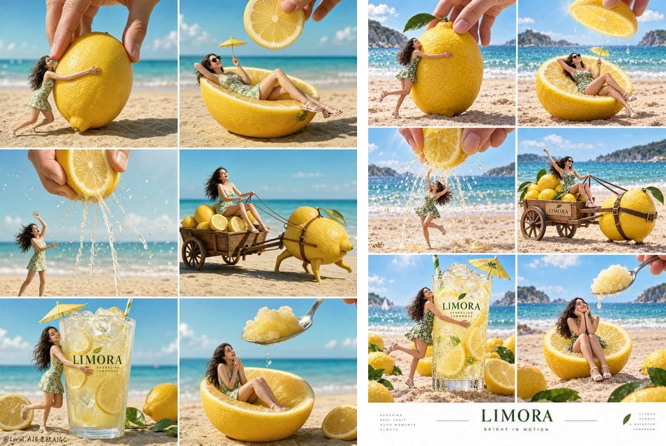
Reproduction notes, not a controlled benchmark
Updated 2026-09-10. Model names, IDs and pricing on this page come from the official OpenAI model documentation for gpt-image-2.5-sunburst and gpt-image-2.5-flare. The four image pairs come from the upstream awesome-gpt-image-2 project. Upstream states that the original images’ generation conditions were never independently verified, and that the tool used for the new runs did not report a model ID, quality tier or cost. The “GPT Image 2” and “GPT Image 2.5” labels are the display labels the upstream project chose. Treat every pair below as one uncontrolled sample per prompt, not as a benchmark.
What GPT Image 2.5 actually is
Earlier image releases arrived as a single endpoint with a quality dial. GPT Image 2.5 arrives as a named pair. Both variants accept text and image inputs, both return images, both are served from the image generation and image edit endpoints, and both support inpainting — masked edits where you paint over the region you want changed and leave the rest of the frame alone. Their published token pricing is identical: text input at $5 per million tokens, image input at $8 per million, image output at $30 per million, with cached inputs discounted to $1.25 and $2 respectively.
Identical per-token pricing is the detail people miss, and it is what makes the choice interesting. The variants do not differ by price sheet; they differ by how much compute a single image consumes and how long you wait for it. Flare is documented as the fastest model for everyday generation and exposes an explicit quality ladder — low, medium, high, xhigh, max and auto. Sunburst is documented as the most capable model for generation and editing. Neither documentation page publishes a fixed list of output resolutions, so treat aspect ratio and size as something to confirm in your own account rather than something to quote from an article.
For anyone arriving from a GPT Image 2 prompt collection, the practical summary is short: the prompt language you already write still works. What is new is a routing decision you now have to make before every batch.
Sunburst vs Flare, side by side
OpenAI’s most capable image generation and editing model in the 2.5 family. OpenAI’s fastest 2.5 model for high-quality, everyday image generation. The two cards below hold only what the official model pages state, plus the task categories each variant is a sensible default for. For a fuller decision framework — including which to pick per creative category — see Sunburst vs Flare.
GPT Image 2.5 Sunburst
gpt-image-2.5-sunburst
Sunburst is the variant to reach for when the image has to be right rather than merely fast: dense multi-panel layouts, in-image typography that has to survive a client review, and edits that must respect the parts of a photo you did not ask it to touch.
From the official model page
- Described on its model page as the most capable model for image generation and editing.
- Accepts text and image inputs; returns images.
- Exposed through both the v1/images/generations and v1/images/edits endpoints.
- Supports inpainting (masked edits on an existing image).
- Listed pricing: $5 / 1M text input tokens ($1.25 cached), $8 / 1M image input tokens ($2 cached), $30 / 1M image output tokens.
Reach for it when
- Campaign posters and multi-panel grids
- Packaging and product shots with legible brand text
- Masked edits and retouching on an existing photo
- Final-quality deliverables that go straight to a client
GPT Image 2.5 Flare
gpt-image-2.5-flare
Flare is the exploration engine. It is documented as the fastest model in the family for everyday generation, and it exposes an explicit quality ladder, so the same prompt can be run cheaply while you are still deciding what the picture should be and then re-run at a higher setting once it is decided.
From the official model page
- Described on its model page as the fastest model for high-quality, everyday image generation.
- Accepts text and image inputs; returns images.
- Quality settings documented as low, medium, high, xhigh, max and auto.
- Supports inpainting and is available on the generation and edit endpoints.
- Listed pricing: $5 / 1M text input tokens ($1.25 cached), $8 / 1M image input tokens ($2 cached), $30 / 1M image output tokens.
Reach for it when
- Moodboards and first-pass concepting
- Batch variations of a settled layout
- Everyday social and blog imagery
- Prompt debugging, where run count matters more than polish
What changed for prompting since GPT Image 2
Nothing about prompt syntax changed. There is no new keyword, no parameter string, no magic prefix. What changed is which parts of a long prompt survive the trip. The four reproductions below were run by feeding complete, unmodified GPT Image 2 prompts back in, and the pattern across them is consistent enough to plan around.
- Structural instructions hold up well. A “2 columns by 3 rows, six aligned panels” contract and a “single squircle icon, 80% of a white canvas” contract both survived intact. If your prompt already states layout as a rule rather than a vibe, keep that sentence exactly as it is.
- Detail density goes up, sometimes past what you asked for. Fur, paper grain, façades and handwritten marginalia all rendered more finely — but the Rio diorama also crowded its margins after a prompt that explicitly asked for “refined rather than crowded”. Density instructions now need to be stated as limits, not preferences.
- Negative prompts still do real work. The watercolour illustration’s “no text, no letters, no logos” block held. The lemon campaign, which had a long negative block about anatomy and copied text, nonetheless gained unrequested branding on a cart. Prohibit what must not appear; do not assume silence means absence.
- Colour and typography choices drift. The app icon kept its layout but changed background colour and redrew its lettering. If a hex value or a specific typeface matters, name it in the prompt and check it in the output — a generated image is never a brand review.
- One sample proves nothing about a model. Each pair below is a single run. Wall-clock times ranged from 61s to 156s, but those numbers include queueing and transfer and are not inference benchmarks. Use the pairs to see how a prompt behaves, not to rank models.
How to reuse your GPT Image 2 prompts on 2.5
Prompt portability is high, so do not rewrite your library. Migrate it deliberately instead, in an order that surfaces problems while they are still cheap to fix.
- Paste it unchanged first. Run the exact GPT Image 2 text on Flare before you edit a word. This is the cheapest way to learn whether the prompt has a real problem or you just have a new habit.
- Convert preferences into constraints. “Refined rather than crowded” is a preference. “No more than six marginal annotations, each smaller than the central subject” is a constraint. The extra detail 2.5 produces makes this rewrite the highest-value edit in most prompts.
- Pin the things you will be judged on. Exact brand text in quotes, background colour, panel count, aspect ratio and typeface. Anything a client will notice should be a sentence, not an implication.
- Climb the quality ladder only when the layout is settled. Iterate on Flare at a low or medium quality setting. Once the composition is right, re-run the same text at a higher setting, or move the final to Sunburst.
- Move edits, not generations, to Sunburst first. If your workflow is “generate once, then fix three things”, the editing half is where the more capable variant pays for itself. Both variants expose inpainting, so a mask plus a short instruction usually beats regenerating the whole frame.
- Keep a fixed sample set. Ten to twenty prompts covering your real categories — poster, UI, product, photo, illustration — re-run on each variant, scored separately for layout, text accuracy and repair time. That is what turns anecdote into a routing rule you can trust.
If you are still building the prompt itself rather than migrating one, the GPT Image 2 prompting guide covers the structure these examples all share, and the GPT Image 2 vs 2.5 comparison covers when staying on 2 is the right call.
Four full prompts, re-run on GPT Image 2.5
Each case pairs an existing gallery image with one new generation from the identical prompt — no reference image, no post-editing, one sample. Copy any prompt in full and adapt the named subjects to your own brief.
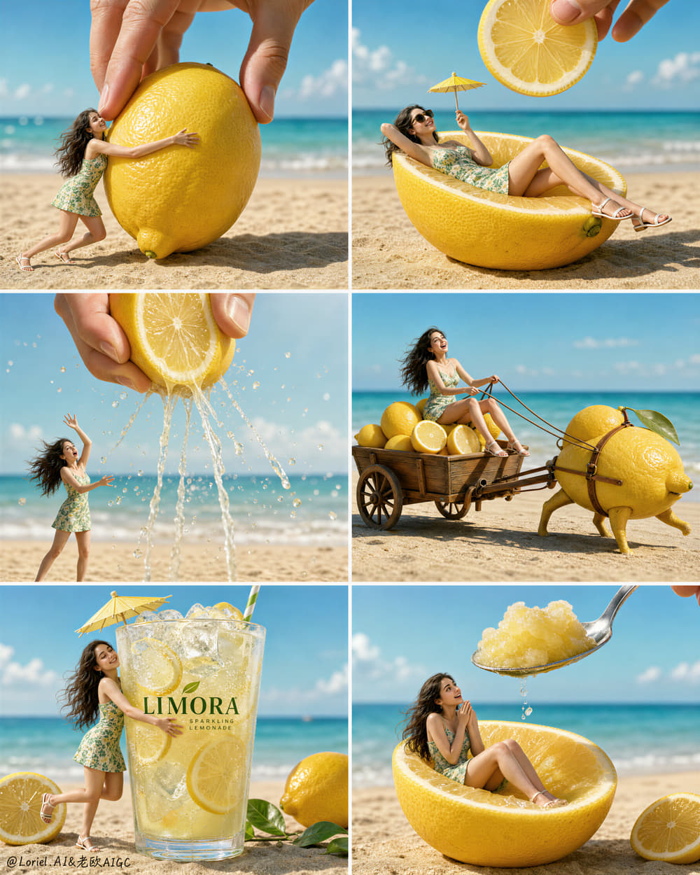
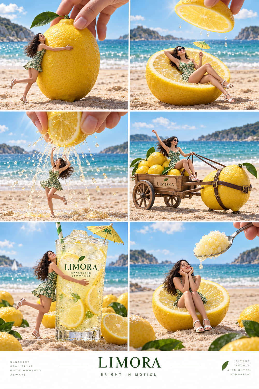
Case #532 — six-panel lemon drink campaign poster
Poster / campaign layout
A 2×3 grid advertising poster for a fictional lemon brand, with a recurring miniature character, a hero product panel and an explicit negative-prompt block. The longest prompt in the set at roughly 8,100 characters.
What changed in this run
- The requested 2-column by 3-row grid and the recurring green dress are present.
- “LIMORA” is readable on the hero glass; citrus, ice, juice and glass are visually detailed.
- Panel 2 shows a dripping lemon half instead of the requested floating lemon slice.
- Extra branding appears on the cart and on the lower campaign strip, which the prompt did not ask for.
Upstream recorded roughly 132s of wall-clock wait for this call, including queueing and transfer — not an isolated inference benchmark. One sample, no reference image, output unedited. Original post: source on X. Case notes: awesome-gpt-image-2.
Create a Cannes-level premium summer beverage campaign poster for a fictional lemon drink brand called "LIMORA", using a strict 2-column by 3-row grid layout with six perfectly aligned panels. Preserve the exact structural logic of the composition: each panel shows the same tiny ultra-realistic young woman on a bright sandy beach interacting with oversized lemons, lemon slices, lemon juice, or the final branded drink, while selected panels include a giant realistic human hand entering from above. The full poster must feel like one unified high-end advertising storyboard in motion, where the eye flows continuously from fresh citrus fruit to crafted beverage desire. The lemon product world must remain the absolute visual hero across all six panels.

Overall composition:
Use a clean six-panel grid with thin white dividers, equal panel proportions, consistent horizon line, consistent beach-ocean background, and unified lighting. Every panel should feel self-contained yet rhythmically connected, as if six consecutive scenes from the same luxury summer commercial were frozen at their most iconic moments. Keep the miniature woman and the oversized lemon-related object centered in each frame, with the sea softly blurred in the background and the sand sharply rendered in the foreground. The full page must read instantly from a distance, with strong commercial clarity and polished editorial control.

Orbit visual flow:
Design the entire set around one strong circulation of motion from panel 1 to panel 6. The action should escalate visually: touch, recline, squeeze, travel, embrace, taste. Use repeating directional rhythms in hair movement, arm gestures, leg angles, juice droplets, spoon angle, lemon slice placement, straw tilt, and the position of the entering hand so the eye naturally sweeps across the poster in a flowing wave. Build subtle diagonal energy inside every panel, making the citrus world feel alive, breezy, sparkling, and in motion. The whole set should feel like summer energy orbiting around the brand’s lemon drink.

Narrative panel sequence:
Panel 1: the tiny woman hugs a giant whole lemon on the sand while a giant adult hand descends from above, delicately positioning the lemon. Her pose is lively and slightly off-balance, as if the scene has just begun.
Panel 2: she reclines elegantly inside a halved lemon as though it were a luxury beach chaise, wearing dark sunglasses and holding a tiny parasol drink pick, while a floating lemon slice is lowered from above like a radiant citrus sun.
Panel 3: a giant hand squeezes a vertically cut lemon from above, sending translucent juice streams and droplets downward in a sparkling arc. The woman reacts dynamically beneath it, arms raised, body tilted, caught in the middle of the citrus action.
Panel 4: she rides in a small refined wooden cart piled with lemons, being pulled by a whimsical premium lemon-shaped creature or rolling lemon harness. The cart must feel physically grounded, artisanal, and stylish rather than cartoonish.
Panel 5: the hero climax panel. A tall branded LIMORA lemonade glass dominates the frame, packed with ice cubes, lemon slices, pale sparkling liquid, condensation, a fresh green straw, and a refined cocktail umbrella. The tiny woman hugs the cold glass joyfully, and this panel must be the strongest product-selling moment in the entire composition.
Panel 6: she sits inside a halved lemon while a large polished spoon descends from above carrying glossy lemon sorbet or crushed lemon ice, creating a final delicious serving beat with playful anticipation.

Hero product focus:
The real hero is the lemon beverage system: whole citrus fruit, sliced fruit, squeezed juice, ice, sparkling drink, sorbet, and premium serving details. Every lemon must feel hyper-real, fragrant, sunlit, juicy, and tactile, with detailed skin pores, subtle waxy oil sheen, translucent membranes, wet cut surfaces, and bright natural citrus pulp. The branded glass in panel 5 must be the most visually dominant product object in the set, with crystal-clear glass, refined original English branding reading "LIMORA", elegant condensation, premium ice refraction, and luminous pale-yellow drink clarity.

Character design:
Depict one recurring ultra-realistic miniature young woman across all six panels, wearing the same fitted green floral mini dress and white sandals, with long dark wavy hair and naturally expressive features. She must look like a real scaled-down human placed into a surreal oversized citrus world. Keep anatomy coherent and believable in every frame: correct head-to-body proportion, realistic shoulders, collarbones, arms, waist, hips, thighs, knees, calves, ankles, and feet, with perfectly formed hands and five fingers clearly visible. Her expressions should shift panel by panel: surprised delight, relaxed confidence, playful alarm, exhilaration, joyful refreshment, amused anticipation. Skin must remain photorealistic with pores, natural tonal shifts, faint knee and elbow texture, realistic skin elasticity, and no plastic AI beauty finish.

Lighting:
Use bright premium seaside daylight with a soft upper-left sun direction and gentle atmospheric diffusion. Maintain luminous fresh summer lighting across all six scenes, with short, soft-edged shadows and crisp dimensional highlights. Juice droplets, lemon pulp, ice cubes, spoon edges, sunglasses, glass rim, and condensation should all catch clean sparkling highlights. Lighting must feel luxurious, refreshing, and physically consistent from panel to panel.

Materials:
Lemons: ultra-detailed peel pores, subtle dimpling, natural rind thickness, glistening wet pulp, believable cut translucency, realistic juice behavior.
Drink glass: high-clarity premium glass, accurate refraction, heavy base, condensation beads, crisp logo print, ice transparency, sparkling carbonated liquid feel.
Sorbet and juice: glossy, semi-translucent, cold, wet, appetizing, physically accurate.
Dress: lightweight summer cotton with tiny green floral print, natural wrinkles, fabric tension, and wind-responsive edges.
Hair and skin: realistic strands, fine flyaways, natural shine, believable skin texture.
Large hand: realistic adult fingers, soft skin compression, natural nails, coherent scale perspective.
Cart and props: refined warm wood grain, polished wheels, believable joints and harness elements.
Beach environment: fine sunlit sand with miniature footprints and pressure marks, soft shoreline blur, clean turquoise sea with pale foam.

Color system:
Build the palette around lemon yellow, fresh citrus green, turquoise sea, pale sky blue, warm beach beige, crisp white highlights, and restrained natural skin tones. Yellow must remain the dominant hero color, supported by green and turquoise. Keep the image bright, appetizing, summery, clean, and internationally commercial. Avoid random accent colors.

Typography and branding:
Do not copy any text from the sample. Keep typography minimal and original. Place refined English branding only on the hero glass and optionally a tiny campaign line below the full grid, such as: "LIMORA — Bright in Motion". Typography must feel premium, modern, minimal, and secondary to the visual storytelling.

Art direction:
Hyper-real premium surreal advertising photography, luxury FMCG campaign, storyboard energy, elegant humor, cinematic micro-world illusion, high-end beverage styling, global summer launch poster, polished magazine-grade finish, sharp product realism, strong narrative rhythm, premium brand coherence.

Negative prompt:
copied text, Chinese text, existing brand names, cartoon style, toy-like figure, grotesque oversized head, deformed anatomy, extra fingers, missing fingers, fused fingers, twisted wrists, broken limbs, distorted feet, AI plastic skin, over-smoothed skin, fake citrus texture, unrealistic juice physics, muddy lemon pulp, cloudy glass, weak product focus, inconsistent lighting, inconsistent horizon, messy grid, cluttered props, meme aesthetic, cheap humor, childish illustration, low-resolution detail, oversaturated colors, dead black patches, distorted giant hand perspective
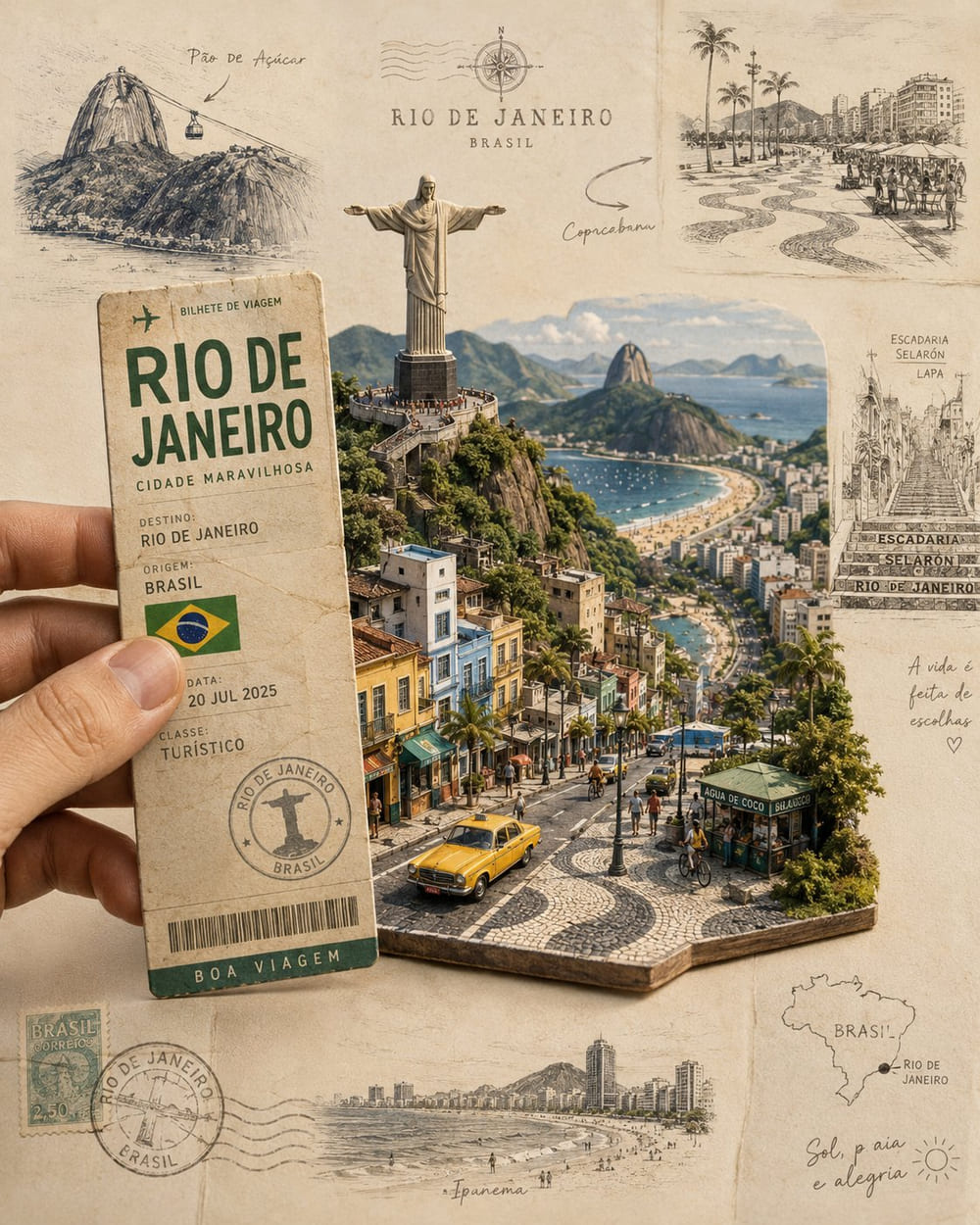
Case #527 — Rio de Janeiro paper-cut travel diorama
Product / photoreal 3D scene
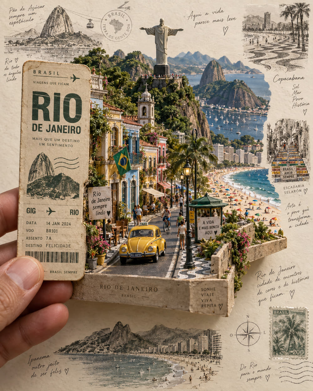
A photorealistic pop-up diorama rising out of a held travel ticket, ringed by hand-drawn marginalia. Tests depth layering, small architectural detail and dense annotation without letting the page get crowded.
What changed in this run
- The ticket, Christ the Redeemer, the yellow taxi and the miniature base are all present.
- Building façades are more prominent than in the original gallery image.
- Handwritten marginal annotations are denser, which pushes against the prompt’s “refined rather than crowded” instruction.
Upstream recorded roughly 127s of wall-clock wait for this call, including queueing and transfer — not an isolated inference benchmark. One sample, no reference image, output unedited. Original post: source on X. Case notes: awesome-gpt-image-2.
Create a highly detailed, photorealistic miniature travel-poster diorama inspired by Rio de Janeiro, arranged as a handcrafted 3D paper scene on a warm ivory, slightly textured background.

In the foreground, a realistic human hand holds a vintage Brazilian travel ticket or Rio-themed transit card vertically on the left side. Give the card aged paper texture, subtle printing imperfections, elegant typography, and authentic-looking travel details. From behind the card, a miniature Rio de Janeiro landscape physically rises outward like an intricate pop-up diorama.

Make Christ the Redeemer the dominant central landmark, positioned high above a miniature cityscape with lush green mountains surrounding it. Below, build a tiny realistic Rio street featuring a classic yellow taxi, colorful buildings, palm trees, pedestrians, cyclists, street lamps, tiled sidewalks, and small Brazilian urban details. Add Copacabana beach elements in the distance with tiny umbrellas, beachgoers, and a glimpse of the Atlantic Ocean. Layer the architecture and terrain so everything appears physically constructed from paper, wood, plaster, and miniature materials, with convincing depth, cast shadows, overlapping surfaces, and a slight three-quarter perspective.

Around the main 3D scene, incorporate delicate black, charcoal, and muted sepia hand-drawn travel illustrations on the cream paper. Include a small Sugarloaf Mountain sketch in the upper left, an artistic Copacabana promenade illustration in the upper right, a detailed Selarón Steps sketch along the right side, and a small Ipanema beachfront skyline drawing near the bottom. Add subtle handwritten travel notes, tiny map markings, architectural outlines, compass symbols, postage-stamp details, and understated Brazilian travel annotations.

Keep the composition refined rather than crowded. Blend realistic miniature photography with vintage travel-journal design, tactile paper fibers, faint ink bleed, imperfect hand-drawn lines, warm natural studio lighting, gentle shadows, subtle film grain, and a sophisticated cream, charcoal, muted green, ocean blue, and Brazilian yellow palette.

The final image should feel like a premium collectible Rio de Janeiro travel postcard transformed into a physical miniature world, with the central diorama sharply detailed and the surrounding illustrations slightly softer. Highly realistic human hand and fingers, believable miniature materials, cinematic product photography, editorial travel-magazine aesthetic, shallow depth of field, ultra-fine textures, photorealistic 3D details, vertical 4:5 composition, 8K quality.
Case #523 — Manhattan park watercolour travel illustration
Illustration / editorial art
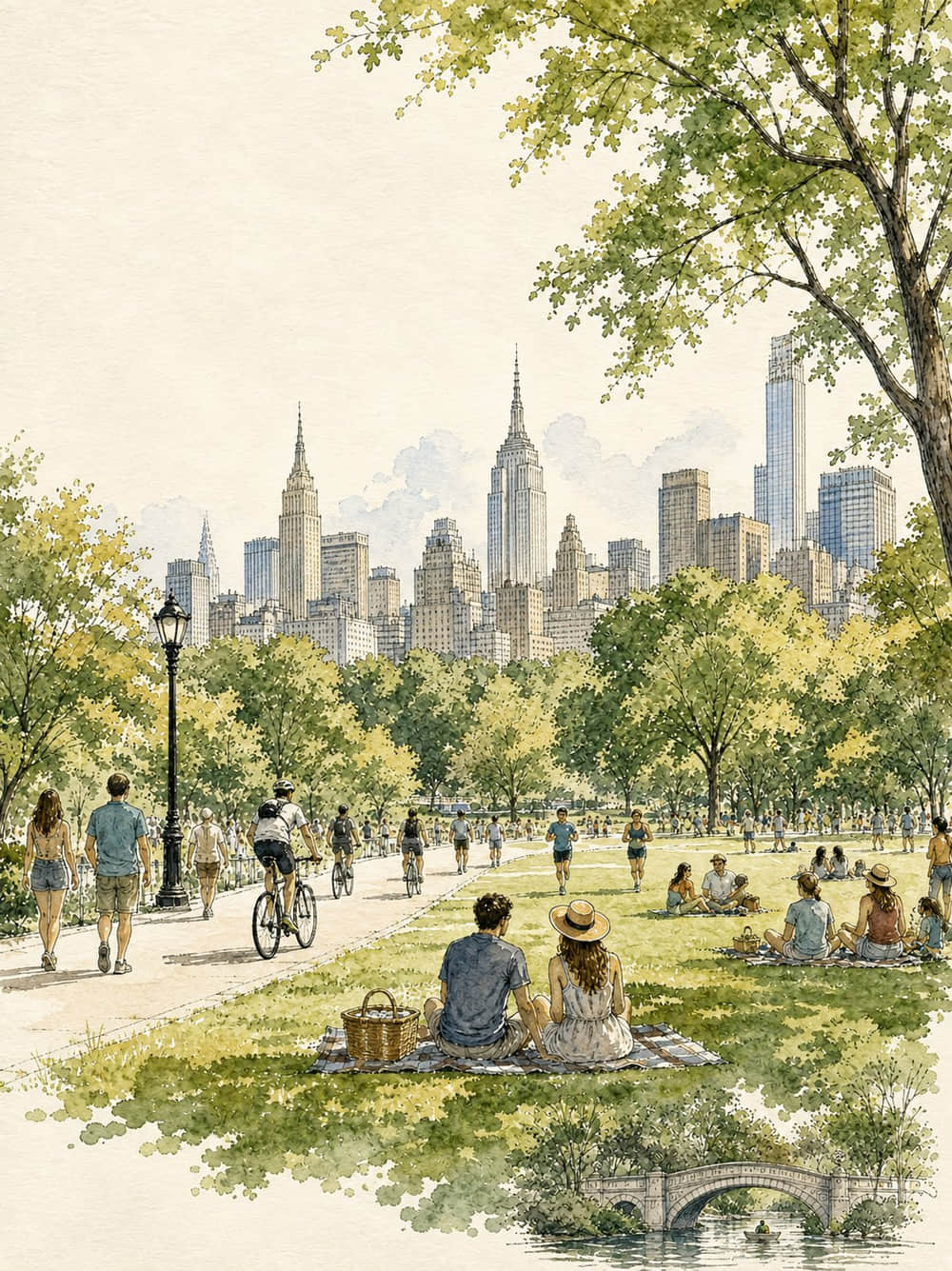
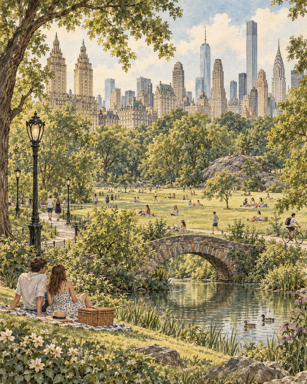
A vertical vintage travel-poster illustration in ink and watercolour, with an explicit “no text, no letters, no logos” constraint. Tests style fidelity and negative instruction compliance.
What changed in this run
- The stone bridge and pond are larger and more prominent in the foreground.
- Trees fill more of the composition; the watercolour-and-ink styling is retained.
- The “no text” constraint held — no visible lettering was added.
Upstream recorded roughly 61s of wall-clock wait for this call, including queueing and transfer — not an isolated inference benchmark. One sample, no reference image, output unedited. Original post: source on X. Case notes: awesome-gpt-image-2.
Create a vertical editorial travel illustration inspired by vintage European travel posters, featuring a peaceful summer afternoon in a grand city park with a recognizable Manhattan-style skyline in the background. Use delicate hand-drawn ink outlines combined with soft, slightly imperfect watercolor washes on warm textured cream paper. Show a wide green lawn filled with people relaxing, reading, walking, jogging, cycling, and having picnics. In the foreground, a casually dressed young couple sits together on a picnic blanket beside a woven basket. Include elegant black vintage park lamps, winding pathways, dense leafy trees framing the composition, and detailed historic and modern skyscrapers rising behind the park. Add a small picturesque stone arch bridge over a calm pond near the bottom of the artwork. Use muted sage green, olive, warm beige, soft blue, pale gray, and subtle golden sunlight, with natural watercolor bleeding, paper grain, fine pen hatching, and an airy sophisticated travel-journal aesthetic. No text, no letters, no logos, no typography, no captions, no signs. Vertical 4:5 composition, highly detailed, elegant, nostalgic, handcrafted watercolor-and-ink illustration.
Case #510 — “Bichon Shop” skeuomorphic macOS app icon
UI / icon design
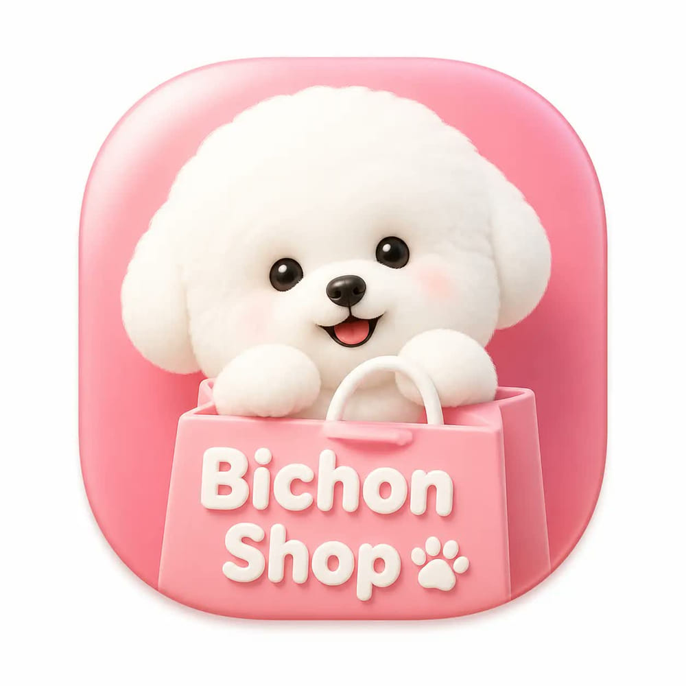
A four-sentence prompt: one squircle icon, white canvas, roughly 80% of the frame, light skeuomorphic App Store style. The shortest prompt in the set and the strictest layout contract.

What changed in this run
- One rounded-square icon stays centred on a white canvas with padding — the layout contract held.
- The dog has more detailed curls, and the bag gains rope handles and visible paper texture.
- The icon background shifts from pink to cream and the “Bichon Shop” lettering is drawn differently.
Upstream recorded roughly 156s of wall-clock wait for this call, including queueing and transfer — not an isolated inference benchmark. One sample, no reference image, output unedited. Original post: source on X. Case notes: awesome-gpt-image-2.
A macOS app icon for an app named 'Bichon Shop'. A single squircle icon with smooth continuous rounded corners, centered on a white canvas with padding, occupying about 80% of the canvas. Modern light skeuomorphic macOS App Store style. Only one icon.
Reproductions and case notes from awesome-gpt-image-2 (MIT) by freestylefly.
Browse GPT Image 2 prompts while 2.5 fills up
PicGens does not yet carry public creator posts labelled GPT Image 2.5 — the model is new and creators are still tagging results as GPT Image 2. Because prompts port across with almost no editing, the existing GPT Image 2 collection is the right place to shop for a starting point today.
Browse all GPT Image 2 prompts →


Frequently asked questions
- What is the difference between GPT Image 2.5 Sunburst and Flare?
- They are two variants of the same release. Sunburst is documented as the most capable model for image generation and editing; Flare is documented as the fastest model for high-quality everyday generation and exposes quality settings from low through max. Both accept text and image input, both support inpainting, and both are served from the generation and edit endpoints at the same published token prices.
- Do my GPT Image 2 prompts still work on GPT Image 2.5?
- Yes — all four reproductions on this page used complete, unmodified GPT Image 2 prompts. Structural instructions like panel grids and icon placement carried over intact. The edits worth making are turning soft density preferences into hard limits and pinning any colour, typeface or brand text you will be judged on.
- Which variant should I use for posters and campaign layouts?
- Draft on Flare and finish on Sunburst. Multi-panel layouts with in-image branding are exactly the case where the capable variant earns its extra time, but the composition decisions — how many panels, what happens in each — are cheaper to settle on the fast one. See Sunburst vs Flare for a per-category table.
- How much does GPT Image 2.5 cost?
- Both model pages list the same token pricing: $5 per million text input tokens ($1.25 cached), $8 per million image input tokens ($2 cached) and $30 per million image output tokens. What a single image costs therefore depends on the tokens it consumes, not on which variant you picked, so measure real spend in your own account before budgeting a batch.
- Are the comparisons on this page a benchmark?
- No, and it matters. Each pair is one uncontrolled sample. The upstream project states that the original images’ generation conditions were never verified and that the tool used for the new runs reported no model ID, quality tier or cost. The “GPT Image 2” and “GPT Image 2.5” labels are upstream’s display labels. Read the pairs as illustrations of how a prompt behaves, never as a ranking.
- Where can I find GPT Image 2.5 prompts to copy right now?
- The four prompts on this page are complete and copyable. Beyond them, the GPT Image 2 collection is the closest live source — public creator posts are still being labelled for the older model, and the prompts transfer with little or no editing.