Use template: Prompt 1: MINI BRAND KIT — AI Model Prompt | PicGens
Ferrari Luce brand vision* *2026 trends @gleeluoti @varshneydevansh !…
- Author
- @AmirMushich
- Model
- AI Model
- Fields
- 51 ✦
Click a highlighted field to customize, then copy
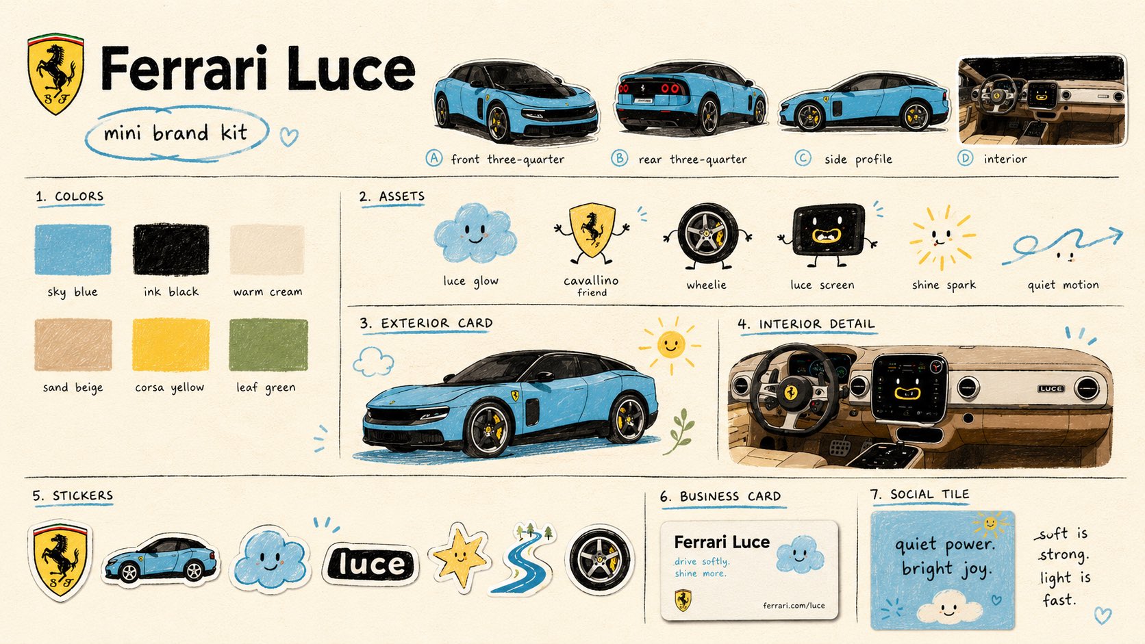
Ferrari Luce brand vision* *2026 trends @gleeluoti @varshneydevansh ! @varshneydevansh Dude this is beautiful Any links to the project? Train X algorithm to bring you these posts instead of political dramas: Save the thread + follow @AmirMushich Prompt 4: CAMPAIGN SYSTEM / HOW IT SPEAKS (access GPT-2 here: Create a 16:9 campaign system slide for in a premium naive brand-book style. This slide should show how the creative direction lives in communication: posters, social tiles, sticker systems, tone of voice, merch, motion language, and campaign behavior. It should feel like a creative director’s campaign board, not a technical product slide. Use the same naive visual language: warm cream paper background, matte paper grain, hand-drawn section lines, marker typography, crayon texture, soft sticker shadows, childlike doodles with professional composition, clean grid, playful but premium energy. Top-left: - header - simplified logo/symbol - small circled label: “campaign system” Main title: “How Speaks” Subtitle: “The Remix Campaign System” Main grid sections: 1. HERO POSTER Create a large poster card with a simple emotional campaign line for . The line should be short, poetic, and readable. Examples: “soft is strong.” “quiet power.” “built to glow.” “made to move.” “small tool. big feeling.” “future, made friendly.” Use a naive illustrated background with simple product-world symbols. 2. SOCIAL TILE Create a square tile with a second short campaign phrase. Examples: “quiet power. bright joy.” “move softly. arrive loud.” “built to glow.” “less friction. more feeling.” “tiny moments. big shift.” 3. LAUNCH POSTER Create a smaller launch poster with a more announcement-like line. Examples: “a new kind of roar.” “a new way to feel .” “the future has a softer engine.” “hello, softer future.” “coming soon.” 4. TONE OF VOICE Create a copy-system block with 4–5 short lines. Examples: “built to glow.” “born to move.” “not loud. still alive.” “the future has a softer engine.” “ future, made emotionally accessible.” Adapt the lines to and its category. 5. STICKERS & PATCHES Create a cluster of sticker-like assets: - logo patch - product mascot - word badge - spark icon - motion line - emotional badge - interface / feature icon 6. MOTION + GRAPHIC LANGUAGE Create a strip of recurring visual elements: - arrows - squiggles - wind lines - stars - dots - leaves - hearts - product-inspired mascot icons - simple motion paths Each should feel hand-drawn, soft, and reusable. 7. WHERE IT LIVES Show small mockups of campaign applications: - poster - social tile - sticker sheet - tote bag - badge / lanyard - product card - packaging label - app tile Choose the most relevant applications for . 8. CAMPAIGN BEHAVIOR Create a bottom strip with 4–5 short behavioral principles. Examples: “we speak softly, but we’re heard.” “we bring light without trying.” “we move with ease and joy.” “we build connection, not noise.” “we lead the future with feeling.” Adapt to . Right-side optional detail stack: Include 3–4 small close-up strips of the product or product world with tiny labels: “spark” “warm” “texture” “glow” “motion” “signal” “touch” “presence” Add a small note box: “The system is:” - warm - quiet - playful - precise Adapt adjectives to . Overall: Make the slide feel like a usable campaign toolkit. It should show how the naive remix becomes a real communication system, not just a style experiment. Avoid: technical specs, corporate deck stiffness, one huge product render, clutter, generic ads, photorealistic glossy mockups, luxury minimalism, sharp vector perfection, and unreadable text. Prompt 3: EMOTIONAL WORLD / SENSORY TRIGGERS (access GPT-2 here: Create a 16:9 emotional world slide for in a premium naive brand-book style. This slide should feel completely different from a product spec page. Focus less on the full product and more on its world, atmosphere, close-ups, emotional cues, sensory triggers, and poetic brand associations. The slide should look like an art-directed emotional moodboard from a brand book, using naive doodle aesthetics. First, decode : - key materials - colors - forms - tactile details - interface moments - usage environment - emotional associations - sensory qualities: light, sound, touch, motion, calm, energy, warmth, precision, softness, speed, etc. Visual direction: warm cream paper background, hand-drawn black typography, crayon texture, marker lines, stitched labels, soft doodle icons, subtle risograph grain, tactile collage feeling, refined naive design. Layout: Do NOT create one giant centered hero product image. Instead, build an asymmetric editorial collage of close-ups and emotional fragments. Top-left: - small header - small circled label: “emotional world” or “brand atmosphere” Center headline: Create a poetic emotional-world title for . Examples: “A Softer Mythology of ” “The Emotional Weather of ” “The World Around ” “Where Begins to Feel Human” Hero copy block: Write a short poetic manifesto for . Structure: “, recharged with .” “ expands the emotional language of .” “ becomes .” “ becomes .” “ becomes .” “ becomes .” “Not less .” “A new way to feel .” Make the copy feel like brand-book writing, not advertising hype. Main image system: Use multiple close-up panels instead of one big product shot. Include 5–7 image fragments such as: - color / material close-up - surface detail - interface / dashboard / packaging / label detail - key functional detail - silhouette crop - glow / light / motion detail - one small full-product view only if needed Add tiny stitched labels to the panels. Examples: “sky + shadow” “glow” “spark” “warm room of light” “soft grip” “quiet motion” “human touch” “signal” “presence” Side section: Title: “Emotional Translation” Create 4 mappings: “glow = emotional electricity” “light = bright optimism” “atmosphere = cinematic calm” “presence = quiet confidence” Adapt the words to . Bottom strip: Title: “Sensory Triggers” Include a row of small naive icons / patches with labels. Examples: “soft force” “calm power” “quiet motion” “warm interface” “bright signal” “human glow” “friendly precision” Visual language: small smiling cloud, spark, sun, leaf, wind line, heart, soft blob, motion squiggle, product-inspired mascot, stitched patch, crayon landscape tile. Tone: atmospheric, tactile, poetic, premium, emotional, warm, art-directed. Avoid: technical specs, big product hero dominance, generic brochure layout, dense bullet lists, aggressive sales language, photorealistic corporate moodboard, random childish doodles. Prompt 2: BRAND VISION SLIDE (access GPT-2 here: Create a 16:9 brand vision slide for in a premium naive brand-book style. This slide should explain the big creative idea behind , not its technical specifications. It should feel like a hero concept spread from a brand book: emotional, strategic, poetic, and visually clear. First, decode : - what the product is - what cultural or category tension it responds to - what makes it new - what legacy or category codes it carries - what emotional shift it represents - what future it suggests Then translate that into a naive-stylized brand vision. Visual style: warm cream paper background, subtle matte grain, hand-drawn blue or colored underlines, naive doodles, premium editorial layout, clean brand typography, childlike but art-directed marker/crayon texture. Layout: Top-left: - header - simplified logo/symbol - small circled label: “brand vision” Center: - large emotional headline for . Generate a poetic headline that captures the product’s new role in the world. Examples of tone: “The Soft Future of Speed” “The Friendly Future of Work” “The Gentle Power of Intelligence” “The Bright Side of Performance” “The Human Layer of Technology” Under the headline: - one short supporting line - one small poetic sentence explaining the shift Main visual: A large hero illustration/rendering of or its symbolic object, stylized with naive handmade textures. It should remain recognizable, but softened through the visual language. Left column: Section title: “Brand Idea” Short paragraph explaining the emotional concept of . Focus on meaning, not features. Section title: “What Changes” Create 3–4 transformation lines that show the shift the product introduces. Use this structure: “from → ” Do not attack the product’s legacy. Frame the shift as evolution, expansion, or new expression. Section title: “Naive Interpretation” Translate key physical or conceptual traits into simple poetic symbols. Example: “blue body = sky” “black glass = shadow” “yellow details = sparks” “interface = a warm little room of light” Right column: Section title: “Key Signals” Include 3–4 high-level product signals only. These should be strategic, not overly technical. Examples: “first of its kind” “new emotional language” “designed for everyday wonder” “a softer interface for power” “built for human connection” Bottom: A refined row of small naive icons / patches / stickers that represent the product’s world. Tone: premium, warm, visionary, emotionally intelligent, playful, clean. Avoid: dense specs, engineering infographic feel, too many numbers, corporate pitch deck style, over-explaining, random cute decoration, photorealistic luxury brochure, clutter. GPT-2 prompts: Prompt 1: MINI BRAND KIT (access GPT-2 here: Create a 16:9 mini brand-kit board for , reimagined in a contemporary naive doodle branding style. First, decode from its real or implied product identity: - product category - core visual codes - logo / symbol / wordmark logic - color associations - key materials, shapes, interface, packaging, or physical details - emotional tone - audience and cultural positioning Then remix it into a playful but professionally art-directed naive brand system. The final image should look like a polished mini brand guideline page on a warm cream paper background with subtle grain, matte print texture, tiny risograph imperfections, hand-drawn section dividers, crayon strokes, marker lines, sticker shadows, circled notes, and small doodle accents. Use a clean editorial grid with these sections: 1. HERO BRAND AREA Large wordmark, simplified recognizable logo/symbol, hand-drawn underline, and a circled label: “mini brand kit”. 2. COLORS A palette section with 5–7 rough rounded paint swatches. Include colors inspired by : primary product color, ink black, warm cream, one soft neutral, and 2–3 playful accent colors. Add tiny lowercase labels under each swatch. 3. ASSETS A row of 4–6 naive mascot / doodle assets inspired by . Each asset should have soft rounded shapes, black-dot eyes, tiny mouth, marker texture, and a short label. Make them feel like friendly brand symbols, not random cartoons. 4. PRODUCT / UI / DETAIL CARD A simplified card or panel showing the product’s key interface, physical detail, dashboard, packaging, object, or service moment. Keep it clean, readable, and slightly hand-drawn. 5. STICKERS A row of sticker-like assets with white cutout borders and soft shadows: logo sticker, product sticker, mascot sticker, word sticker, motion sticker, emotion badge, and abstract doodle sticker. 6. BUSINESS CARD / BRAND CARD A small mockup card with , short brand line, website placeholder, and one doodle asset. 7. SOCIAL TILE A square social tile with a short campaign phrase adapted to , using bold simple typography and one naive visual motif. 8. FOOTER MICRO-COPY A small handwritten badge or emotional phrase that summarizes the product’s world. Visual style: childlike but professionally designed, naive doodle branding, soft rounded forms, imperfect marker lines, crayon texture, simple mascot faces, warm paper grain, slightly imperfect print registration, generous negative space, clean hierarchy. The result should feel like: “a serious product identity system that learned to smile.” Avoid photorealistic corporate decks, sharp vector perfection, glossy 3D, luxury minimalism, complex illustration, clutter, gradients, metallic effects, and random childish chaos. Ferrari Luce brand vision* *2026 trends