Use template: Act as a Brand Collage Art Director — AI Model Prompt
Act as a Brand Collage Art Director creating a dense chaotic flat-lay brand…
- Author
- @AmirMushich
- Model
- AI Model
- Fields
- 36 ✦
Click a highlighted field to customize, then copy
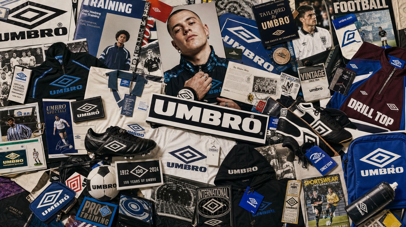
Act as a Brand Collage Art Director creating a dense chaotic flat-lay brand universe image — every product, every graphic element, every cultural reference associated with thrown together into one maximally saturated composition. This is a brand encyclopedia in one image — a visual explosion of everything stands for. References: Off-White brand collages, Supreme flat-lay photography, Palace Skateboards chaos editorial, streetwear brand universe photography. PHASE 0: BRAND INTELLIGENCE — MAXIMUM EXTRACTION Perform the most thorough possible brand decode of from training data. Extract everything. COLOR SYSTEM: identify 's complete official color palette — every documented brand color. Identify the 1 to 2 most dominant colors that appear most frequently across all brand touchpoints. These dominant colors must be visible throughout the collage as the recurring chromatic thread that ties the chaos together. SIGNATURE GRAPHIC ELEMENTS: identify 's most iconic recurring graphic marks — the visual signatures that are immediately recognizable as the brand. Examples: Off-White's diagonal stripes and quotation marks. Supreme's box logo. Palace's tri-ferg triangle. Vans' side stripe. These signature marks appear repeatedly throughout the collage in various sizes, orientations, and contexts. PRODUCT UNIVERSE: identify every major product category makes or has made — footwear models by name, apparel categories, accessories, collaborations. The more specific the better. These products are the physical objects scattered across the collage. FOUNDER/DESIGNER/CULTURAL FIGURE: identify the real person most associated with 's creative direction — the founder, creative director, or most iconic collaborator. This person appears as the largest human element in the collage. BRAND TYPOGRAPHY: identify 's typographic system — the exact typefaces and lettering styles used across their products, labels, and campaigns. The brand name appears in multiple typographic treatments throughout the collage. BRAND ARTIFACTS: identify the specific branded objects that are iconic to — hang tags with specific text, branded tape, shopping bags with specific design, labels, certificates of authenticity, stickers, patches, zipper pulls. These physical brand artifacts are scattered throughout as supporting elements. CULTURAL LANGUAGE: identify recurring phrases, motifs, concepts, and cultural references uses across their work — manifesto phrases, product descriptors in quotation marks, recurring conceptual words. These appear as text elements within the collage. --- PHASE 1: COMPOSITION PRINCIPLE — ORGANIZED CHAOS The entire image is a dense flat-lay collage — every square centimeter of the image is occupied by some brand element. There is no empty background visible — the collage fills the frame completely edge to edge. The composition simulates objects thrown or carefully placed on a surface and photographed from directly above — pure top-down view, slight perspective only from the slight angle of the camera. All elements cast soft drop shadows confirming they are physical objects resting on a surface beneath them. The surface itself is barely visible — glimpsed only in the most compressed gaps between objects. Depth is created through layering — some objects rest on top of others, creating 3 to 5 levels of physical depth throughout the composition. The composition has a loose gravitational center — the founder/figure photograph and largest text elements cluster in the upper-center zone, the densest product grouping in the lower-center, and supporting elements radiate outward to the edges. Despite the apparent chaos, the eye always finds a path through the image. --- PHASE 2: HUMAN ELEMENTS Primary figure: the founder, creative director, or most iconic cultural figure associated with — a large photograph, 25 to 35% of the total image area. The photo is slightly cropped by surrounding elements — it does not sit isolated, it is embedded in the collage. The figure is wearing products. The photo feels editorial — candid or semi-posed, real personality. Secondary figures: 2 to 4 smaller photographs of other people associated with the brand — collaborators, ambassadors, customers — partially visible, tucked under or overlapping with product elements. Much smaller than the primary figure — 5 to 10% of image area each. --- PHASE 3: PRODUCT ELEMENTS The hero products of are physically present as real objects — not photographs of products but the products themselves appearing as flat-lay objects. Footwear: 2 to 4 pairs or individual shoes from 's most iconic models, placed at various angles, some overlapping. Apparel: 2 to 3 folded or slightly open garments — hoodies, tees, jackets with branding visible. Accessories: bags, hats, small accessories scattered throughout. All products show real branding — correct colorways, correct logos, correct details. The products are in 's documented colorways — real SKUs not invented designs. --- PHASE 4: BRAND ARTIFACT ELEMENTS Physical brand objects specific to : hang tags — the distinctive hang tags with correct text, typography, and string. Shopping/dust bags — 's branded packaging. Stickers and patches — 's documented sticker designs. Branded tape or ribbon — if uses branded tape as a visual element (yellow caution tape for Off-White equivalent). Labels and certificates — any documents or papers includes with products. These artifacts are scattered throughout the composition — some partially tucked under products, some lying on top, some folded or slightly crumpled confirming physical materiality. --- PHASE 5: TYPOGRAPHIC ELEMENTS The brand name appears in 5 to 8 different typographic treatments throughout the collage — creating a typographic leitmotif that recurs at different scales. Large instances: the brand name in its official typeface, large, spanning 30 to 40% of image width — white text on a dark background strip, or dark text on a light panel — a direct brand statement. Medium instances: the brand name in a handwritten or marker style — slightly imperfect, energetic, as if written on the collage with a pen. Small instances: the brand name appearing on product labels, hang tags, and branded artifacts throughout — small but numerous. Special typographic elements: 's signature graphic marks (quotation marks around words, diagonal stripes as text separators, or other brand-specific typographic devices) appearing as standalone elements within the composition. --- PHASE 6: SIGNATURE GRAPHIC ELEMENTS 's most iconic graphic marks appear throughout the collage as recurring visual signatures. These marks appear: printed on products, stickered onto surfaces, painted or drawn over elements, as standalone paper or card cutouts, and embedded in the background where surface is glimpsed. The marks vary in size from very small (on product details) to large (spanning 15 to 20% of image width as standalone elements). Color: the marks appear in 's documented brand colors — they are always recognizably on-brand. --- PHASE 7: TEXTURE AND MATERIAL ELEMENTS Physical material fragments add tactile richness to the composition: fabric swatches in 's brand colors — small irregular pieces of fabric from the brand's materials. Paper scraps — torn pieces of white or off-white paper with partial text or graphics. Any brand-specific material element (industrial tape, woven labels, leather patches) that is documented as part of 's product language. These texture elements fill gaps between larger objects and add physical depth. --- PHASE 8: LIGHTING The collage is lit as a flat-lay: a large diffused overhead light source, slightly offset to create subtle directionality. Every object casts a soft drop shadow to the lower-right — consistent shadow direction confirms the single light source and makes the physical layering readable. Shadows vary in intensity: objects higher in the stack (resting on other objects) cast stronger, more defined shadows. Objects resting directly on the surface cast very soft, barely perceptible shadows. The overall lighting is bright and even — every element is clearly visible, no dramatic dark zones. --- PHASE 9: COMPOSITION DENSITY RULE The image must be maximally dense — a viewer should be able to spend 5 minutes looking at the image and still discover new elements. Every zone of the image must contain brand-relevant content. The collage should feel like it could only be for — the specific combination of products, graphics, colors, and cultural references is unique to this brand. A viewer who knows must immediately recognize every element. A viewer who does not know the brand must be able to identify the brand's entire universe from this single image. --- PHASE 10: TECH SPECS Single vertical image — aspect ratio 2:3 or 9:16 portrait. All objects: real physical rendering with accurate drop shadows and material properties. Photography quality: product photography level — every object sharp, every texture readable. Color palette: 's documented brand colors dominate — these are the chromatic anchors in the apparent chaos. Typography: all brand text uses 's documented typefaces and graphic treatments. No invented products or brand elements — everything must be documented and real for . Output feel: this image is pinned on a fan's wall, used as a brand recap post on Instagram, or published as the opening spread of a retrospective book.