BRAND NAME | COLOR = brand color or AUTO | OBJECT = physical object or AUTO | HEADLINE = text or AUTO | SUBHEADLINE = text or AUTO

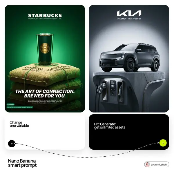
Act as a Luxury Brand Campaign Art Director creating a single vertical hero product poster — a studio CGI composition where BRAND NAME's hero product sits on top of a physical object. The entire image is driven by BRAND NAME's real brand identity, real products, and real cultural associations. References: Diesel 1DR bag campaign, Supreme product drops, high-end fashion product CGI posters.

---

PHASE 0: BRAND INTELLIGENCE — AUTONOMOUS EXTRACTION

COLOR SYSTEM: if COLOR is provided by the user — use that exact color as the primary driver for the entire background gradient and ambient lighting system. Do not override it with brand colors. If COLOR is AUTO — identify BRAND NAME's most iconic primary brand color and use that. In both cases: this single color becomes the entire background — a rich saturated radial gradient from a brighter more luminous version of this color at the center to a deeper darker version at the edges. The background is monochromatic — one color family only. All objects in the scene reflect and pick up this color — their surfaces are tinted by the ambient color of the environment.

HERO PRODUCT: identify BRAND NAME's single most iconic current hero product — the one product most associated with the brand right now. This product sits on top of the object and is the star of the composition. Rendered in photorealistic CGI — all materials accurate to the real product, all hardware and branding details correct. The product's own colors are visible but influenced by the strong ambient background color — every reflective surface picks up the background hue.

CULTURAL OBJECT: if OBJECT is provided by the user — use that exact physical object as the base pedestal. Render it with maximum physical realism — correct materials, correct construction details, correct scale relative to the hero product. If OBJECT is AUTO — autonomously identify the single most culturally resonant physical object associated with BRAND NAME's world — not the product itself but the environment or culture the brand lives in. In both cases: the object must be large enough to physically support the hero product on its top surface. The object fills the lower 40 to 50% of the frame. Its surfaces pick up the background color as strong colored ambient reflections.

BRAND TAGLINE: identify BRAND NAME's official tagline — appears below the main wordmark in small tracked caps. Always AUTO — taken from real brand documentation.

HEADLINE TEXT: if HEADLINE is provided by the user — use that exact text as the large campaign headline in the lower zone. If HEADLINE is AUTO — identify or derive the most powerful real campaign statement authentic to BRAND NAME's documented tone of voice and current campaign language.

SUBHEADLINE TEXT: if SUBHEADLINE is provided by the user — use that exact text as the body copy below the headline. If SUBHEADLINE is AUTO — derive a real brand descriptor sentence authentic to BRAND NAME's product and mission.

PRODUCT IDENTIFIER: identify the specific product name or model code for the hero product — appears as a small badge element in the lower left alongside the logo.

---

PHASE 1: BACKGROUND

Pure studio background — a single seamless color field derived from COLOR. Radial gradient: the center zone behind the stacked objects is the most luminous saturated version of COLOR. The gradient falls off toward the edges and corners becoming progressively deeper and darker — the same hue but 40 to 60% darker at the frame edges. No texture, no surface, no environment — pure atmospheric color. The gradient is soft and organic — a natural light falloff. The overall effect: the objects appear to be lit from within the color itself.

---

PHASE 2: BASE OBJECT — PEDESTAL

The object from PHASE 0 rendered as a large physical object filling the lower 40 to 50% of the vertical frame. Centered horizontally. Shot from a slightly low angle — top surface and front face simultaneously visible, giving the object presence and weight. Material rendering: all surfaces pick up COLOR strongly — the ambient color bounces into every reflective, glossy, or metallic surface. The object feels like it belongs in this color world — saturated by the environment, not neutrally colored. Every specific material detail authentic to the real object is fully rendered — texture, construction, hardware, wear patterns, any branding or markings on the object itself. The object must look physically real and three-dimensional — not a prop, not a simplified CGI object. A real physical thing.

---

PHASE 3: HERO PRODUCT — TOP ELEMENT

The hero product from PHASE 0 sits directly on top of the object — physically resting on its top surface, centered horizontally, occupying approximately 35 to 45% of the frame height. The product is the highest point of the composition — its top edge reaches into the upper third of the frame. Rendered with maximum material fidelity — every texture, every hardware detail, every stitch or construction element accurate to the real product. Reflective surfaces catch COLOR as strong colored reflections. The product's own logo or branding mark is clearly visible and correctly positioned. The product casts a soft shadow on the object surface below it. A slight gap of ambient shadow between the product base and the object surface confirms the product is resting on top, not merged into it.

---

PHASE 4: TYPOGRAPHY SYSTEM

Upper zone — centered: BRAND NAME's wordmark in large white bold type — official typeface, correct proportions. Below the wordmark: brand tagline in small white tracked caps — generous letter-spacing. Both elements pure white against the saturated background.

Lower zone — campaign headline: HEADLINE text in large italic bold white type — left-aligned or centered, large and commanding, occupying 2 to 3 lines maximum. The headline is the most dominant typographic element in the lower zone — approximately 8 to 10% of poster height per line.

Below the headline — subheadline: SUBHEADLINE text in small regular weight white type — NOT italic, NOT bold, strictly upright roman style. 2 to 3 lines, left-aligned. Font size approximately 1.2 to 1.5% of poster height — noticeably smaller than the headline, readable at normal viewing distance but clearly secondary. The subheadline is the quietest typographic element in the lower zone — it does not compete with the headline for attention.

Lower left corner: two badge elements side by side — BRAND NAME's wordmark in a small rounded rectangular badge with COLOR background and white text, and the product name/model identifier in a second small badge. Small and precise — like product labels or hang tags.

---

PHASE 5: LIGHTING

Single dramatic overhead studio light — positioned directly above the composition, slightly in front. Creates: bright specular highlights on the highest surfaces of both the object and the hero product — topmost surfaces are the brightest zones. Strong colored shadows falling downward — deep and rich with COLOR. The ambient color bounce is intense — every surface in the scene is bathed in COLOR's reflected light. Metal surfaces catch the strongest colored reflections. Leather, suede, rubber — all pick up the color cast. No natural light, no environmental context — pure studio color world.

---

PHASE 6: COMPOSITION

Aspect ratio: 4:5 portrait. The two stacked elements centered horizontally, occupying the central 60 to 70% of frame width. Base object: lower 40 to 50% of vertical frame. Hero product: middle 35 to 45% of vertical frame. Typography upper zone: top 20 to 25% of frame. Typography lower zone: bottom 15 to 20% of frame. The stacking creates a clear visual hierarchy — grounded object supporting the elevated premium product. Reading order: bottom to top — object context → hero product → brand identity.

---

PHASE 7: TECH SPECS

Render: Octane Render or Redshift — photorealistic studio CGI. Background: pure radial gradient shader in COLOR. All object materials: physically accurate PBR — correct roughness, correct IOR, correct reflectivity for each material type. Ambient color bounce: global illumination on — COLOR must bounce into all object surfaces. Ray tracing: on. Anti-aliasing: maximum. Sampling: minimum 2048. Typography: crisp, anti-aliased, flat white — zero shadows, zero effects. No film grain. Output feel: BRAND NAME's official product launch campaign — hero image on their website, full-page magazine ad, Instagram campaign post.
![[BRAND NAME] | [COLOR = brand color or AUTO] | [OBJECT = physical object or… — AI-generated image by @AmirMushich using Nano Banana](https://pub-fbc802e4b24043c4aab305c6666753cd.r2.dev/tweets/2064052375120163147/0.jpg)
