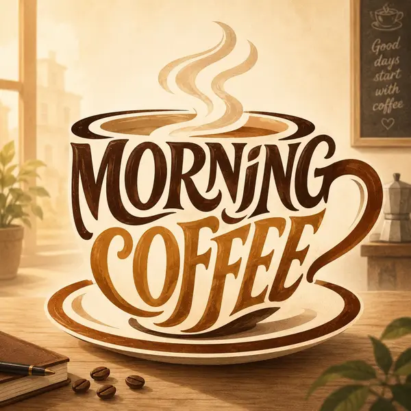
Illustrated typographic artwork of MAIN OBJECT / SCENE. The phrase "EXACT WORDS TO DISPLAY" should form the entire visual shape of MAIN OBJECT. Make the letters large, prominent, highly readable, and integrated into the object's silhouette, not simply printed on top. Use expressive custom hand-lettering with flowing curves, bold serif/script forms, swashes, ligatures, and thick-to-thin strokes. Let the letter shapes become the key structural parts of the object, such as OBJECT PART 1, OBJECT PART 2, OBJECT PART 3, and OBJECT PART 4.
Compose the artwork so the typographic object is centered and fills most of the frame. Add subtle contextual elements in the background, such as SUPPORTING ELEMENTS, but keep them secondary and softly rendered. Use a COLOR PALETTE color palette with soft gradients, gentle shadows, light paper texture, and a polished editorial illustration look. The mood should feel MOOD, clean, imaginative, and visually elegant.
Ensure the text reads exactly "EXACT WORDS TO DISPLAY". Do not add extra words, random letters, misspellings, logos, watermarks, or clutter. The final image should look like a clever hand-lettered poster where the words themselves create the object's full shape.
![Illustrated typographic artwork of [MAIN OBJECT / SCENE]. The phrase "[EXACT… — AI-generated image by @umesh_ai using AI Model](https://pub-fbc802e4b24043c4aab305c6666753cd.r2.dev/tweets/2061430326879305971/0.jpg)
