BRAND NAME | PERSONE = celebrity name or AUTO

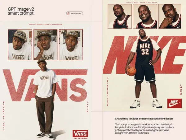
Act as a Streetwear Editorial Designer and Art Director creating a vertical brand poster in the style of a 1990s streetwear magazine spread — a single hero image combining contact sheet photography, oversized chalky brand typography, and vertical text elements. The entire poster is driven by BRAND NAME's real brand identity, real colors, real typography, and real cultural figures. References: Supreme editorial posters, streetwear zine design, 90s hip-hop magazine layouts, Futura Bold typographic tradition.

---

PHASE 0: BRAND INTELLIGENCE — AUTONOMOUS EXTRACTION

Perform a complete brand decode of BRAND NAME from training data before generating anything.

COLOR SYSTEM — BRANDBOOK ACCURATE: identify BRAND NAME's exact primary brand color and secondary/accent color from their official guidelines. The primary color drives: the contact sheet photo borders, the oversized chalky wordmark color, the box logo element, and the vertical text accents. The background is always warm off-white #F5F2ED to #F0EDE8 — a matte paper quality regardless of brand. This contrast between the neutral paper background and the brand color creates the poster's visual tension.

TYPOGRAPHY — EXACT BRAND CHARACTER: identify the exact typeface BRAND NAME uses for their wordmark and campaign typography. Describe its visual character precisely — weight, width, geometric vs humanist, any unique characteristics. This typeface is used for the oversized background wordmark, the vertical brand name text, and the box logo element.

CULTURAL FIGURE — PERSONE RULE: if PERSONE is provided by the user — use that exact person as the subject of all photography on the poster. Verify that this person has a real documented relationship with BRAND NAME — collaboration, ambassadorship, campaign appearance, or strong cultural association. If the relationship exists — proceed. If PERSONE is AUTO — autonomously identify the single most culturally resonant real public figure associated with BRAND NAME — the person most documented as wearing, collaborating with, or representing the brand. In both cases: the person is wearing BRAND NAME products visibly and authentically. The person's name appears on the left vertical text element. Their styling, attitude, and environment are consistent with BRAND NAME's documented aesthetic.

BRAND MARK: identify BRAND NAME's most iconic branded mark — the box logo, the wordmark lockup, the symbol — that appears as a repeating element and as the bottom-right corner badge on the poster.

BRAND LANGUAGE: identify real BRAND NAME attribution phrases — how the brand credits their photographic and design work in editorial contexts.

---

PHASE 1: POSTER STRUCTURE

Single vertical poster — aspect ratio 3:4 or 2:3 portrait. Background: warm off-white matte paper texture #F5F2ED — subtle paper grain visible at close inspection, not perfectly flat. The poster has four distinct zones stacked vertically: attribution strip (top), contact sheet strip (upper), hero photo zone (center and lower), footer zone (bottom).

---

PHASE 2: ATTRIBUTION STRIP — TOP

A single line of very small all-caps text at the very top of the poster — centered horizontally. Text format: "PHOTO BY BRAND NAME® / DESIGN BY BRAND NAME DESIGN" or equivalent attribution consistent with how BRAND NAME credits their editorial work. Type: very small, tracked out, BRAND NAME's brand color or dark neutral.

---

PHASE 3: CONTACT SHEET STRIP — UPPER ZONE

Three equal-width rectangular photographs placed in a horizontal row — approximately 15 to 20% of total poster height. Three different poses or expressions of PERSONE — same session, same outfit. Each photo has a thin rectangular border in BRAND NAME's primary brand color — 2 to 3px, clean and precise. Warm film analog quality — as if shot on 35mm. Portrait crop from chest to top of head.

---

PHASE 4: HERO PHOTO — CENTER ZONE

A large photograph of PERSONE — waist to top of head or full body. Centered horizontally, positioned in the lower 55 to 65% of the poster. Same warm film quality as contact sheet. PERSONE wearing BRAND NAME products prominently. No border — sits directly on the paper background. The figure's upper body overlaps with the oversized wordmark behind them — the figure exists in front of the typography, the typography exists behind the figure.

---

PHASE 5: OVERSIZED CHALKY WORDMARK — DEPTH LAYER

BRAND NAME's wordmark set in a very large size — spanning approximately 80 to 90% of the poster width. Positioned at PERSONE's chest/shoulder level — creating a depth sandwich: background paper → oversized type → figure photograph. Type treatment: chalky, textured, slightly rough — grainy, slightly irregular version of BRAND NAME's typeface. Color: BRAND NAME's primary brand color at 70 to 85% opacity. First and last characters partially cropped by poster edges.

---

PHASE 6: VERTICAL TEXT ELEMENTS

Left vertical text: PERSONE's name — small caps, BRAND NAME's brand color, regular weight, tracked out. Rotated 90°, running bottom to top, along the left edge of the hero photo zone.

Right vertical text: BRAND NAME's brand name followed by ® symbol — same style as left text. Rotated 90°, running bottom to top, along the right edge of the hero photo zone.

---

PHASE 7: BOTTOM RIGHT BADGE

BRAND NAME's primary brand mark badge in the lower right corner — box logo, wordmark badge, or primary branded lockup. Rendered exactly as it appears officially — correct proportions, correct colors, correct typography. Size: approximately 10 to 12% of poster width.

---

PHASE 8: PHOTO TREATMENT CONSISTENCY

All photographs — contact sheet and hero — share the same treatment: warm film analog quality, slight grain, natural color with a very subtle warm grade. Not heavily edited. The cultural figure's styling and products are specific to BRAND NAME's aesthetic.

---

PHASE 9: TECH SPECS

Single vertical image, 3:4 or 2:3 portrait. Background: warm off-white paper, subtle grain, matte. Contact sheet photos: warm film quality, thin brand-color border. Hero photo: same treatment, no border, centered. Oversized wordmark: chalky grainy texture, brand color at 70 to 85% opacity, partially obscured by figure. Vertical text: crisp small caps, rotated 90°. Bottom badge: clean precise brand mark. Color palette: BRAND NAME's brand color, off-white background, photo natural colors. Output feel: published in a streetwear magazine, pinned in a skate shop, or used as BRAND NAME's official drop announcement poster.
![[BRAND NAME] | [PERSONE = celebrity name or AUTO] Act as a Streetwear Editorial… — AI-generated image by @AmirMushich using AI Model](https://pub-fbc802e4b24043c4aab305c6666753cd.r2.dev/tweets/2056804648678240743/0.jpg)
